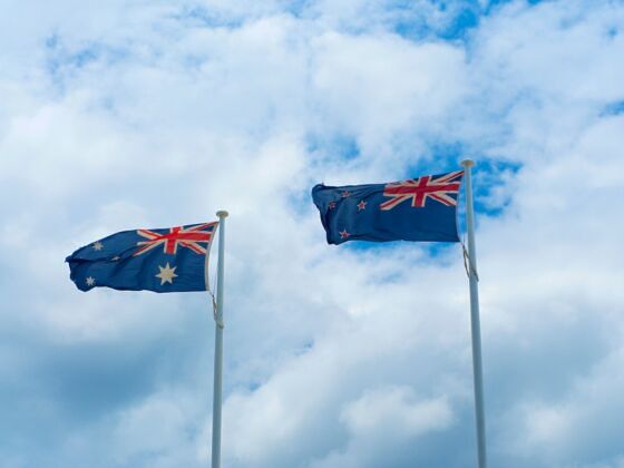
New Zealanders who travel know what a struggle it is to convince others of our difference from Australia. We have a completely different landscape, climate, cultural and ethnic composition, history, language and accent (sort of), but our flags are almost identical. Australia’s is the Southern Cross constellation on a blue background, with the Union Jack in the top left corner. New Zealand’s is the same, only the stars are red, not white, and there are four of them, not six. As a naturalised New Zealander — rather than a born-and-bred one — it took me years to remember which is which. And sometimes I still get confused.


Here's What's Going on With New Zealand's Flag Debate, and the Underlying Themes That Go Along With It
New Zealand is currently deciding whether to change the flag, but the country is in an uproar; and a lot of people are very angry with Prime Minister John Key and his government. So what’s all the fuss about?
During the 2014 New Zealand election, Key — who has been the PM since 2008 — promised that if his National Party was re-elected, they would hold a referendum on whether or not New Zealand should adopt a new national flag before the end of his term, in 2017. In early 2015, new flag design submissions were invited for the Flag Consideration Project, from ordinary New Zealanders and professional designers alike. More than 10,000 new flag designs were submitted, including the comical laser-kiwi, bungy-jumping sheep and other oddities made world famous by comedian John Oliver.
The 10,000 was whittled down to 40 finalists by a team nominated by Members of Parliament. Most finalists contained one or more of three design elements that are important in New Zealand: the Southern Cross, the constellation that appears on the present flag; a koru, a stylised Māori symbol of an unfurling fern frond; and/or a silver fern, a white fern leaf on a black background, native to New Zealand’s forests. These 40 finalists were then further narrowed down to four, announced on September 1st. In November, New Zealanders will rank these four designs in the first of two binding referendums. In the second referendum, to be held in March 2016, voters will be asked whether the winner of the first round should replace the current flag. So after all this effort, after the 10,000+ design submissions and over $25 million spent on the campaign, New Zealand may still vote to keep its current flag.
The flag issue has been contentious from the start. In early 2015, around 70% of New Zealanders polled were in favour of keeping the current flag, yet Key decided to spend astronomical sums on the process of changing it. New Zealand is not economically prosperous right now, so many people have been upset by this waste of resources. Further, there are strong suspicions that the flag campaign was encouraged to divert the public’s attention from some serious political issues, such as the Trans-Pacific Partnership with the USA and other nations, the details of which have been kept secret from the New Zealand people.
In a post-colonial state that is steadily drifting further and further from the British ‘motherland’, the redesign of the flag could be considered a positive sign, one of progress and recognition that New Zealand is a mature and independent nation that is not reliant on Britain, or even big-brother Australia. However, the push to change the flag has come from a neoliberal, right-wing, conservative PM who has repeatedly, in his seven-year rule, shown himself to be beholden to big business and corporate interests.
People from across the political spectrum have objected to the flag project for a range of reasons: some because they honestly don’t want to change the flag and others because they don’t agree with Key’s way of going about it. However, when the final four designs were revealed on September 1st, a new outcry arose. The designs are, in many peoples’ opinions, weak and uninspired. Even supporters of flag change have said that the finalists are an embarrassment to the process, and to principles of good design. Prominent media commentator Russell Brown has said: “After all this contemplation, we seem to have wound up with what you’d get if you hadn’t really thought about it.”
One key problem is that three of the four designs include the silver fern, Key’s stated favourite. Two of these are identical apart from the colour scheme, and were designed by the same person, Kyle Lockwood. The fourth is a stylised koru that has been dubbed the “hypno-flag” due to its mesmerising swirl. While it’s true that no short-list will please everybody, the final four appear to have impressed practically nobody, except Key and his MPs. The panel of 12 that selected the final four include scholars, ex-local politicians and councillors, entrepreneurs and business-people, other public figures… but no designers or artists at all.
Also troubling is the fact that despite many strong finalists, Māori-inspired design has been rather overlooked. At 15% of the population, Māori are a minority in New Zealand, but they are a culturally and politically visible minority. Māori symbols and cultural achievements are respected and a source of pride for New Zealanders of all ethnic backgrounds. So, for Māori design elements to be so under-represented in the final four is insulting, and not reflective of New Zealand’s diversity and plurality.
The silver fern symbol that appears on three of the flags is currently used on everything from the All Blacks’ rugby jerseys to the national tourist board logo. The trouble that a lot of people have with the silver fern as a national flag is that it is too reminiscent of marketing and commerce, something that’s ubiquitously emblazoned on tourist t-shirts to keyrings to bumper stickers to rugby balls. A country might hope for something more for a national flag, although with an ex-banker in charge and a commerce-heavy selection panel, that’s all the choice New Zealanders have been given.
Since the final four were unveiled, a rogue favourite flag design has emerged: Red Peak. This, by Aaron Dustin, deliberately evokes the Māori myth of Ranginui and Papatuanuku, the sky father and earth mother who lie locked together. Dubbed ‘first to the light’, it represents New Zealand’s geographical uniqueness, as the first country in the world to see the new day. Rising in the centre is a stylised white mountain, representing New Zealand’s many mountains and volcanoes. Beneath is a red triangle, representing the earth. To the left is a black triangle, representing night, and to the right a blue triangle, representing dawn. Dick Frizzel, a New Zealand artist whose work has repeatedly explored New Zealand iconography, is an outspoken supporter of Red Peak, saying of the other four designs: “They’re so f—— tragic I can’t believe it. I’m sure Kyle [Lockwood, designer of two of the fern flags] is a lovely boy but that is such an aunty flag, such a nanny flag.”
Red Peak’s cause has gained momentum, and in mid-September, a petition with over 50,000 signatures was tabled in Parliament, calling for Red Peak to be included as a fifth option on November’s referendum. Red Peak has been called brilliant and revolutionary. It has drawn support from both the left and right of the political spectrum, who not only oppose the four uninspired selections, but are annoyed with Key’s handling of the campaign. Key had at first refused to include Red Peak as a fifth option, saying that doing so would be against due process. However, on September 23rd he did an about-face after an agreement with the Green Party, New Zealand’s third-largest political party. Red Peak will be added as a fifth option in November’s referendum.
A criticism of Red Peak is that it is not representative enough of New Zealand, in that it does not contain any of the symbols that New Zealanders and foreigners alike have come to associate with the country. Yet this is its strength to its supporters. As Red Peak’s designer Aaron Dustin has said, “I appreciate the ideas and thoughts of the designers and panel but I think where we’ve ended up does not capture the hearts and minds of New Zealand.” It’s hard not to see this struggle over a flag as the struggle between New Zealand’s past as an isolated British colony that has often been overlooked by the rest of the world, and its future as a multicultural, progressive and creative nation of the 21st century. With the inclusion of Red Peak as a fifth option, New Zealanders now have a wider, better choice. Whether or not the flag will actually change remains to be seen in early 2016. Yet Red Peak’s supporters believe that even if this is not adopted as the official national flag, New Zealand has just got itself a new, distinctive emblem that represents creativity, tradition, culture, and perseverance.