How to Take Better Travel Photos

Travel
by Lola (Akinmade) Åkerström Jul 9, 2008
Join a growing community of thousands of travel journalists and develop your skills in travel writing, photography, and film with a course at MatadorU.

EVER GLANCED in exasperation at travel photographs wondering why yours taken of the same landmarks or subjects never turn out as stunning?

Great travel photographs share a few similarities even though their subjects may be as different as a sweeping landscape or a brooding portrait.

“A” for Action

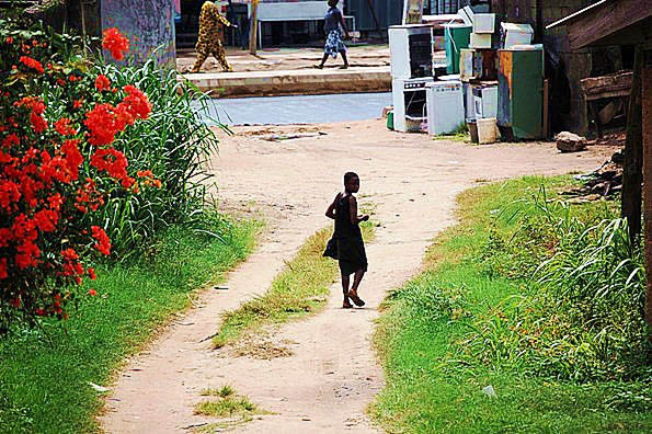
Travel photographs that always work portray some sort of action. It could be a soft glance over a steaming coffee mug or an aggressive rugby match on a muddy pitch. Capturing action in your photographs adds atmosphere that an otherwise straight-on shot cannot.

The same concept can be applied to landscapes. A photograph depicting a lush green meadow can easily transform from boring to interesting if you captured a couple grazing white sheep as well. Including other elements in action into your landscape shots will also add a sense of scale in comparison to their backgrounds.

I could have easily taken a snapshot of the girl walking away, but sooner or later, I knew she’d turn back. Call it the sixth sense, but people subconsciously know when they’re being watched. That’s how some of the more memorable travel portraits are taken.

“B” for Balance

Not “white Balance” which refers to the amounts of red, green and blue (RGB) colors in a photograph, but rather, the process of creating a balanced photo. You’ve probably heard the terms “framing” or “rule of thirds” thrown about in terms of photography.

In a nutshell, it means your travel photograph needs to be symmetrical and aesthetically attractive in the framing of its subjects. Balance can be achieved without putting subjects right in the center of the frame. Using natural frames like arches, doorways or windows can also balance your photographs.

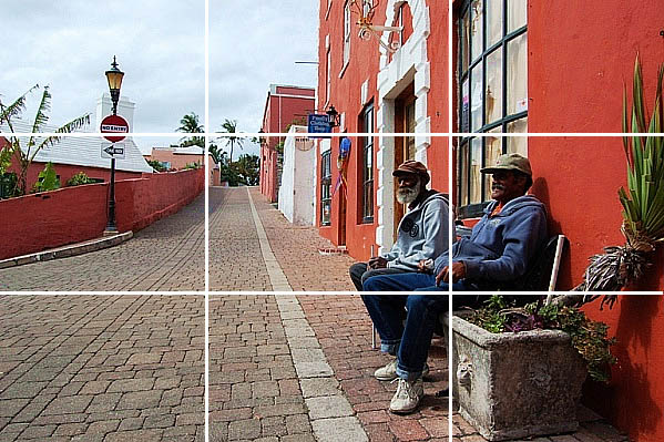
The photo above of two locals taking a break in St. Georges, Bermuda shows how I’ve applied the rule of thirds by shifting them off center to the right side of the photograph.

“C” for Composition

Although “C” alphabetically comes after “B”, composition always comes before balance in travel photography. How you paint a blank canvas or compose a musical piece can be likened to how you compose a photograph. You mentally map out what story you want your photo to tell.

Composition means looking for patterns, textures, angles, vivid colors, placing of your subjects, close-ups, framing, and other visual cues to help tell your story.

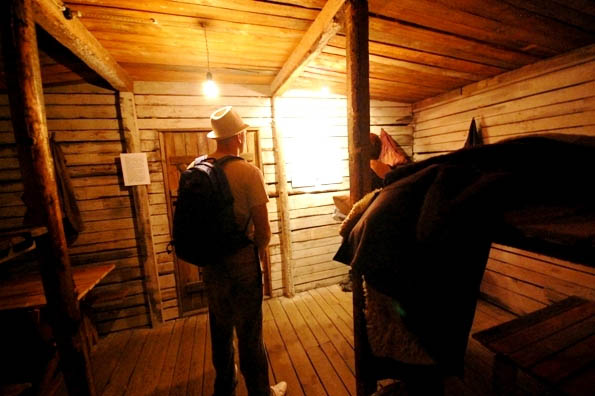
I’m using the composition rule of “subject placement” in the photograph above.

At first glance, you will notice the light bulb aligned above his head. As you notice more details, you will see he’s wearing a backpack and is looking towards a plaque on the wall. The story I’m conveying is that he is a traveler in a museum who has been enlightened by what he is reading.

You’ve heard the old cliché, “the devil is in the details.” With travel photography, the strength of the photograph lies in subtle details. Looking for little details that others might otherwise overlook usually completes the story you’re trying to convey with your photograph.

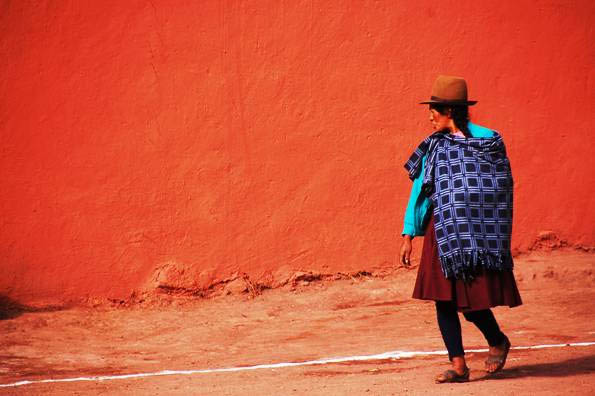
Another composition technique I applied below was looking for “vivid colors” to tell a story. I waited patiently for the Quechua woman below to reach the terracotta-colored wall because I knew her bright blue shirt would pop against the wall once she reached it.

Going back to high school days of art class, we were taught that blue and orange are complementary colors which work well together.

Focus on Photography by Fodor’s explores composition in great detail.

“D” for Depth of Field

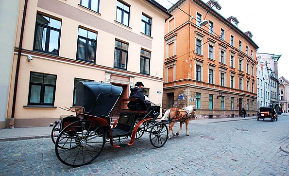
In layman’s terms, depth of field means depicting distance between subjects of focus and their backgrounds in your photos. The subject in the foreground is usually sharp and in focus, gradually fading out. According to Cambridge in Color, “Depth of field is the range of distance within the subject that is acceptably sharp.”

The photograph taken in Riga, Latvia illustrates this concept. Fodor’s provides an excellent explanation on controlling depth of field.

“E” for Evocation

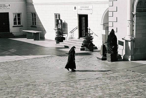
The one common trait memorable travel photographs share is that they evoke a sense of time and place without being cliché. Snapping a photo of a monk in front of a wall is exactly what it is – a photo of a monk in front of a wall, but photographing a monk around cultural icons, incorporating shadows, and other angles not only gives you a better photo overall, but can also help viewers get the full story.

At first glance, the picture above depicts a nun walking. But as you look at more details within the picture, you get a full sense of where she is.

She isn’t carrying a bag or other personal effects which suggests she is someplace familiar. The direction and length of her shadow suggests mid to late afternoon, and the Slavic-type text on the walls suggests somewhere in Central or Eastern Europe. So the picture transports you to a monastery or nunnery in Eastern Europe around late afternoon.

* * *

Always remember that a good travel photograph isn’t one that is technically perfect, but one that instantly transports you there.

*From pro photographers to someone just getting started with a DSLR, the MatadorU travel photography course was created to serve a variety of students.

Discover Matador

Save Bookmark

We use cookies for analytics tracking and advertising from our partners.

For more information read our privacy policy.