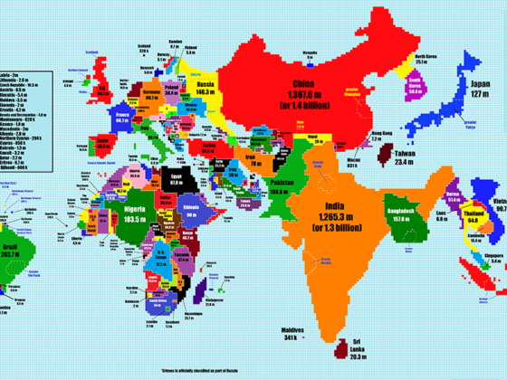
RECONSTRUCTING MAPS based on different variables can be super helpful for understanding the world form a different perspective. A new cartogram by Redditer TeaDranks rescales the world’s countries not according to geographic area, but according to their population size.
For example, Canada transforms into a tiny jagged line whereas India takes up a ton of space. We’re able to easily understand that North Korea has a bigger population than Australia, Denmark pretty much disappears from the map, and China dwarfs Russia.
To check out a high-resolution version of the map, click here.![]()