13 Maps That Will Change the Way You Think About Population Density

Sustainability
by Wait But Why Apr 9, 2014

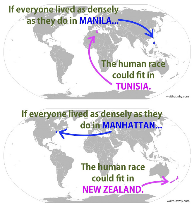
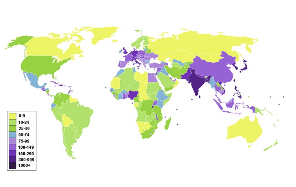
I’VE ALWAYS BEEN INTERESTED in the distribution of the human population across the globe. It’s far from an even spread; the map above shows where people are most squished in (dark colors) and where they’re spread out (light colors).

And the East Asian countries in particular are so jam-packed with people that there’s this insane fact:

Map with Asia highlighted

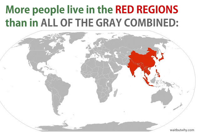
(Parts of Malaysia and Indonesia have been intentionally left out — without them, the red regions still contain more than 50.2% of the world’s population.)

To gain perspective on just how differently people are living on this planet, I looked up the average population density of a particular city, state, or country and imagined all humans living at that density. Or, put another way, how many square miles would be needed to fit all 7,103,900,000 members of the human race if all of us were living at the exact density of various places in the world.

Here are some of the findings:

Maps comparing population

(Aside: If all the habitable land on Earth were as densely populated as Manhattan, you could fit 1.73 trillion people on the planet. Let’s not do that.)

Figures about population density

This post was originally published at Wait but Why and is reprinted here with permission. Wait But Why posts every Tuesday. To receive Wait But Why posts via email, click here. 

Or you can visit their homepage, pop into Facebook, or connect via Twitter.

Discover Matador