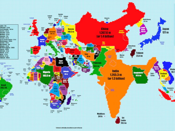
THE STRANGE THING about maps is that much of them are taken up by countries with relatively small populations: Canada and Russia, for example, are huge countries, but their population together makes up less than 3% of the world population as a whole.
Reddit user TeaDranks put together this cartogram of what the world map would look like if we sized the world’s countries in terms of their total population rather than in terms of their total land area. ![]()
A map with higher resolution is available here.