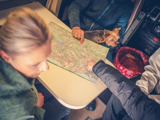
I spend a lot of time with maps these days. I’ve recently moved to a city I know only peripherally, so sometimes I carry around in my back pocket a fold out paper city plan and try to look at it when no one’s looking at me. (Then again, even familiar cities have unfamiliar streets – when I lived in Montreal, it took me four months to figure out where Rue de Brésoles was, even though I went there every week.) I don’t mind, though – there’s a wonderful sense of spatial satisfaction to maps. Lines on paper try to order our world, and how we make them is an interesting reflection of how we perceive the space we inhabit. (Consequently, cartographers I’ve met get into heated debates about things like projection angles and raster definition, boring everyone else at parties.)


Unsurprisingly, the internet has brought us a digital map explosion. Everyone knows Google maps, but there are many other interesting cartographic projects kicking around the internet. Here are four that I personally like, though there are myriad others. The maps below can help you hear the sounds of city streets, bake bread, build a bike, or watch the winds over North America. Sometimes, despite it all, I think we live in a fantastic age.
1. The Montréal Sound Map
The Montreal sound map is a geographic portrayal of the noise of the city of Montréal. You can hear ordinary things, like trucks rumbling on the Autoroute Decarie and people having coffee in downtown coffee shops, but also things like people singing and throwing glass into the vastness of the grain silos around the canal, their voices echoing off the walls of giant industrial cement columns. There are church bells, pianos in the cathedral, monkeys in the zoo, overpasses at night, and other things that are not like any of those things. You can explore the streets at will and you can think of what it would have been like to stand at that particular corner with a recorder in hand on September 30, 2002.
2. The Czech Republic Sourdough Starter map
Sourdough bread is made using naturally occurring yeast. The process involves making a mixture of flour and water and waiting for natural yeast and bacteria to come hang out with it. Once this happens, the dough can start rising, but it can be a painfully slow and ornery process, so it’s much easier to just get a piece of naturally yeasted dough (called a starter) from someone who has one and then keep it alive. Enter the sourdough map, which maps people in your neighbourhood who have a sourdough starter and are willing to share it. The heartening and fascinating thing about it all is the sheer number of participants — from the map it looks like no matter where you are, there is someone within ten kilometers of you who will help you bake homemade bread. Here, in our little forgotten country of the Czech Republic, invisible in the streets, is a whole army of people who care about homemade food. The project is simple and brilliant and fills me with some small amorphous optimism about the world.
3. The worldwide cycling atlas
This website maps community organizations around the world that involve bikes. Some of them build bikes and send them to developing countries, some host rides that raise money for charity organizations, while others are bike cooperatives — essentially volunteer-run bike tool libraries that enable you to, say, fix your bottom bracket without buying your own crank puller. All of them have one thing in common – they somehow combine riding bikes with trying to make something somewhere better. The map functions as both an encouraging display of bike enthusiasm and a directory – if you want to get involved with two-wheeled activism, the worldwide cycling atlas is a good springboard.
4. The wind map
More an art piece than something you’d use to find your way, this map displays the speed and direction of the winds over the United States in real time. It uses data from the National Digital Forecast Database to show the gales cirlcing the great plains and the nor’easters over Maine as white lines on grey, continually in motion. Its authors, a mathematician and a designer, jokingly warn not to use their piece to pilot planes or fight wildfires. Still, their map is mesmerizing to look at, a powerful visual reminder of the scale of the atmospheric processes that go on above us.