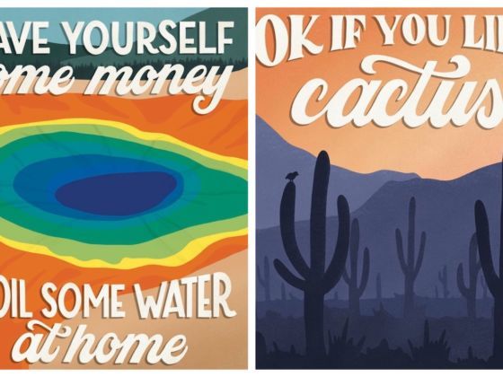
Bad reviews can be depressing but designer and illustrator Amber Share knows how to put a positive spin on even the most negative criticisms out there. Share looks at sites like Yelp, TripAdvisor, Google, and Facebook to find complaints about US national parks, and then combines those negative reviews with beautiful illustrations. She calls the series “Subpar Parks,” and its Instagram account already has over 56,000 followers.


These Hilarious National Park Posters Are Based on Their Worst Reviews
The finished product is a humorous and clever way of exposing the ridiculousness of people’s national park complaints.
The image for Yosemite, for example, reads, “Trees block view and there are too many gray rocks.”
Indeed, there’s nothing worse than when trees block your view of the great outdoors.
One review left for Saguaro National Park in Arizona read, “Ok if you like cactus.” Because we all know that visitors to Arizona are constantly surprised and annoyed by how many cactuses there are.
Other instant classics include White Sands National Park, which is “Literally miles of white sand.”
And, of course, the biggest mythbuster of them all — the Grand Canyon. Defying all expectations, this wonder of the world is, in fact, “a hole. A very, very large hole.”