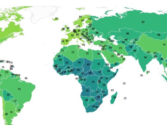
THE FACT THAT life expectancy has dramatically improved throughout the world in the past century is not a brand new piece of information, but seeing just how much it has risen is quite extraordinary.
Rafael H. M. Pereira created the map below to show how the life expectancy of each country has changed from 1950 to 2015 and how it is expected to increase up to 2100. Pereira used data from the UN World Population Prospect 2015 for his work.