In London, there certainly seems to be a strong connection between how much you pay in rent and how close you live to the city center. At least, that’s what this map, originally published by London financial firm Totally Money and uploaded to Reddit by user wundaii, shows. As the tube lines snake their way under the city from the outskirts towards downtown, the rent prices steadily rise with each passing stop. Londoners who live downtown pay a pretty penny for the luxury.
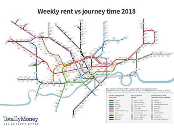
Photo: TotallyMoney.com
This Map of the London Underground Shows the Average Price of Rent at Every Stop
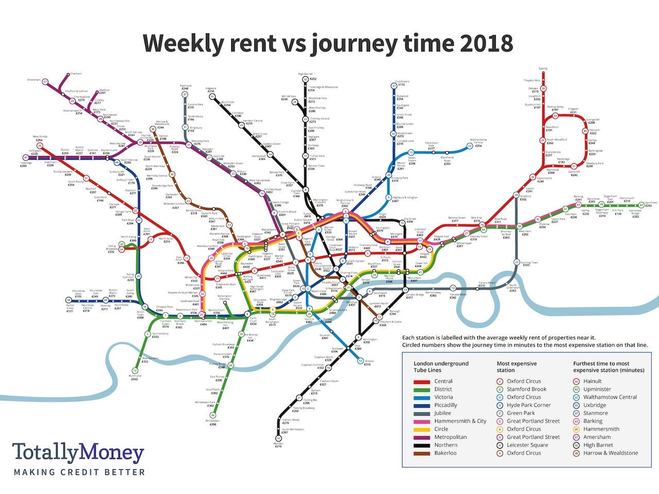
Photo: TotallyMoney.com
The most notable distinction on the map can be seen by following just about any of the subway lines in towards the center: there are multiple points where the rent jumps over 100 pounds in just a couple stops. The most expensive point is right in the center: the Oxford Circus station, where you’ll pay an average of £636 (about $860) per week in rent for a one bedroom apartment. Leicester Square clocks in at £562 (about $760) per week.
Contrast the convenience of living in or close to downtown with the London subway system’s most affordable stops, such as Hatton Cross on the southwest end at £121 (about $164) per week and Cockfosters way up north at £172 (about $233) per week. While these rents may still seem quite expensive to those accustomed to smaller towns with a far cheaper cost of living, to most Londoners, anything under £200 per week surely sounds like an absolute bargain.
When it comes to best lines to live on, commenters seemed to agree that the Victoria line held up well. “Tottenham Hale is a good shout then if you’re just weighing up cost and travel time alone. Victoria line is very fast, frequent and has good connections,” noted user rickyf30. ![]()
T/L Totally Money