BY NOW, you’ve probably heard that just about every map of the world you’ve ever looked at is wrong. The Mercator projection of the globe (see figure A below) is the most common way to display the world, but because a sphere cannot be shown on a flat surface without distortion, the countries’ shapes and sizes are misrepresented. In the case of Africa, the bias is quite impressive; according to The Economist, “This results in Africa […] appearing smaller than […] Greenland when it is in fact 14 times larger.”

Photo: Kai Krause
The True Size of Africa
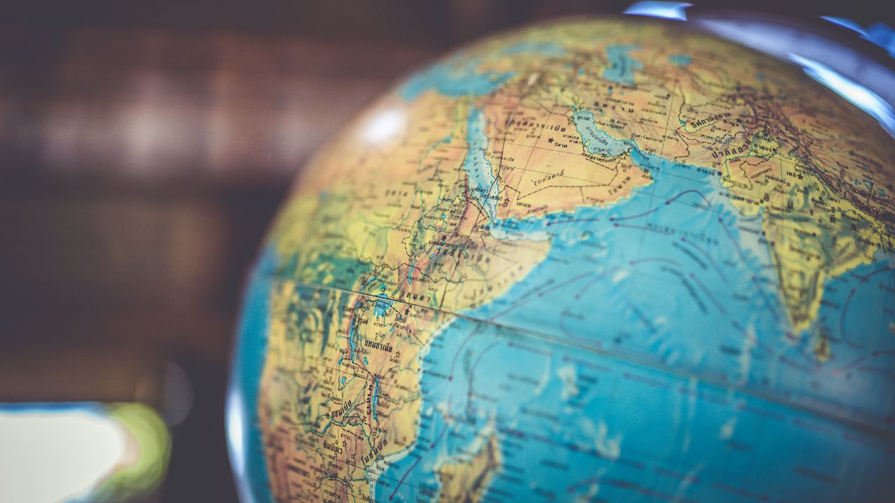
Photo: Aris-Tect Group/Shutterstock
To open our eyes to this distortion, Kai Krause, the famous graphical user interface designer, created a map called “The True Size of Africa” which shows how many countries the continent can contain, and it is mind-boggling. Africa is bigger than “the entirety of the USA, all of China, India, as well as Japan and pretty much all of Europe as well — all combined!,” explains Krause.
What do you think of Kai Krause’s map? Did you know that Africa’s size was misrepresented? Let us know in the comment section. ![]()
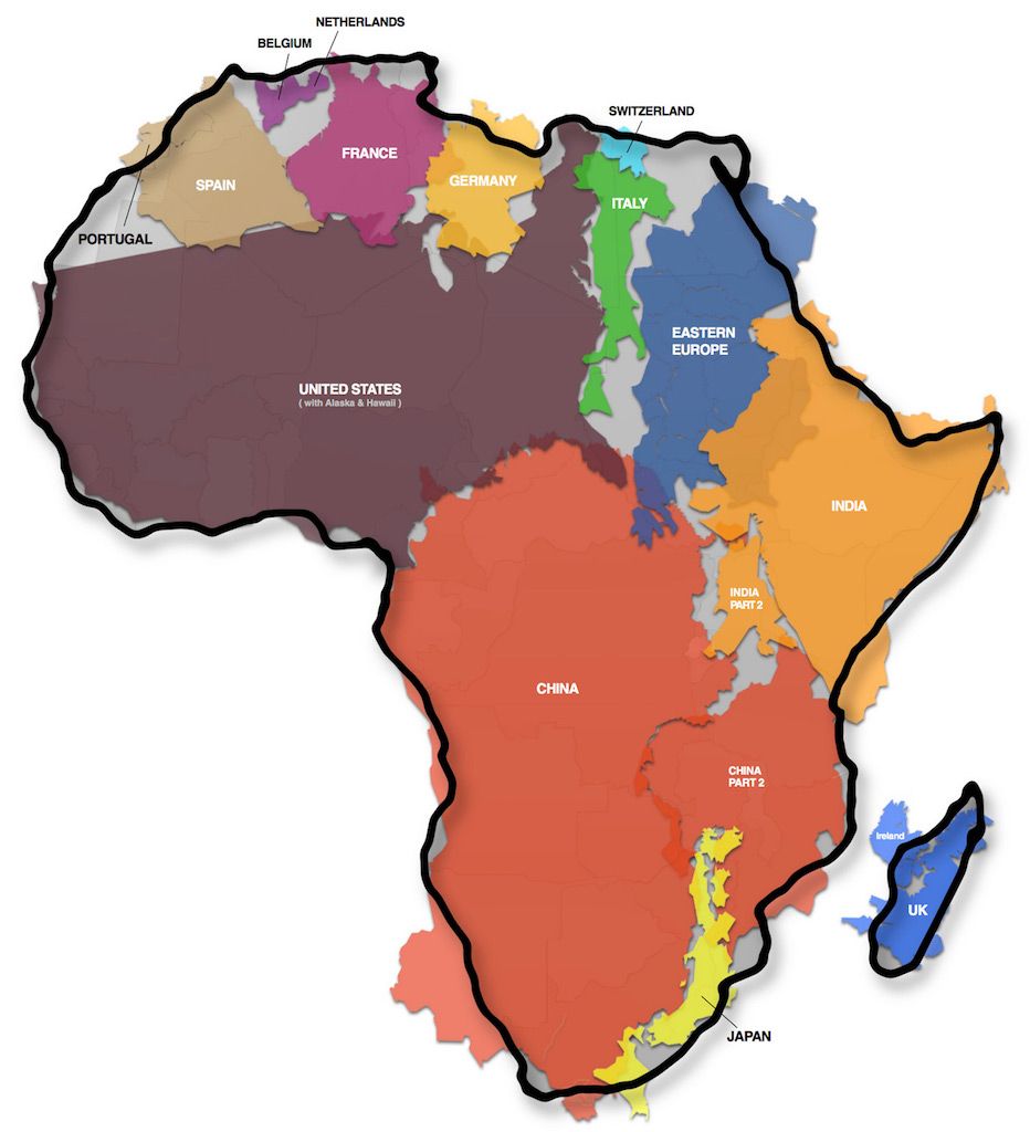
The True Size of Africa by Kai Krause. Licensed under CC BY 2.0
To know more about Kai Krause’s process and research about this map, click here.