EVEN IN THE AGE OF THE INFOGRAPHIC, maps are still the undisputed champion of conveying information visually. True, many maps — including some of the ones on this list — don’t really tell you anything you can use in your life in a meaningful way. You’re just not going to find a practical use for knowing which countries have names that end in the letter A, or which American lake is the home to a mythical eel pig, or whether or not Coloradans hate the LA Lakers.
On the other hand, maps can transmit immensely important political and cultural information. How does culture shift over time? Which areas will be the worst off if sea levels rise? How many countries recognize Palestine as a sovereign state?
I’m of the opinion that all knowledge — useful or otherwise — is worth knowing, so both types are on this list. Enjoy.
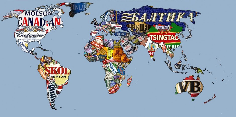
1. Most popular beers by country
The next time you hear an Englishman talking about how Americans like shitty beer, point out that England’s favorite beer — despite a pantheon of other incredible options — is Carling. Most countries seem to prefer watery beers, most notably Saudi Arabia, where alcohol is illegal and the Beck’s is non-alcoholic. Image via
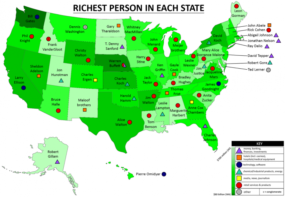
2. The richest person in each US state
Who is the richest person in your state? And how much do you need to save to beat them? Image via
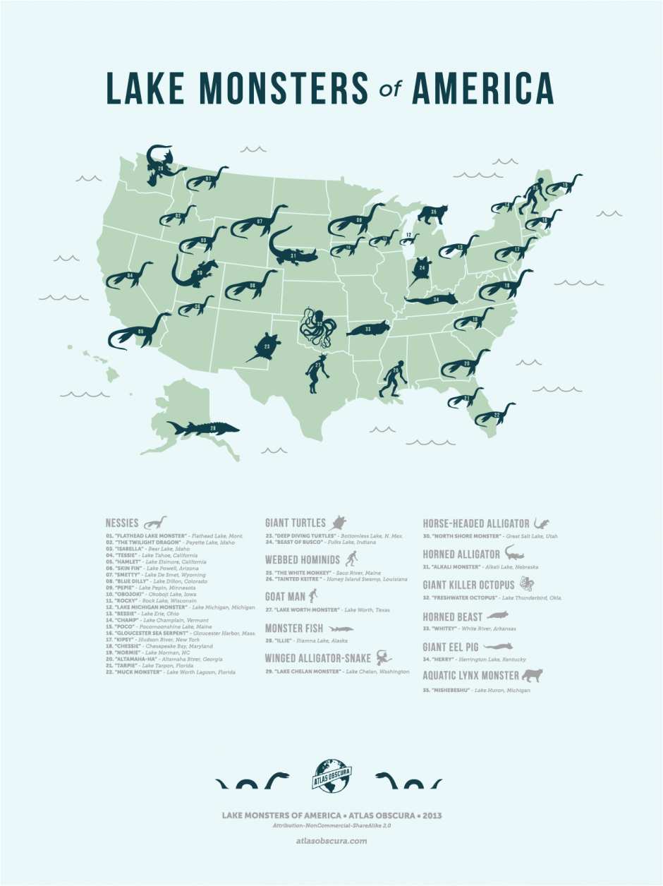
3. Lake monsters of America
Atlas Obscura, cataloguer of the world’s weird-ass shit, put together this excellent map of the many supposed lake monsters of the United States. While Nessie-style sea serpents are by far the most popular, Americans have reported sightings of goat men, eel pigs, and aquatic lynxes as well. Check out their site for a more in-depth breakdown. Image via
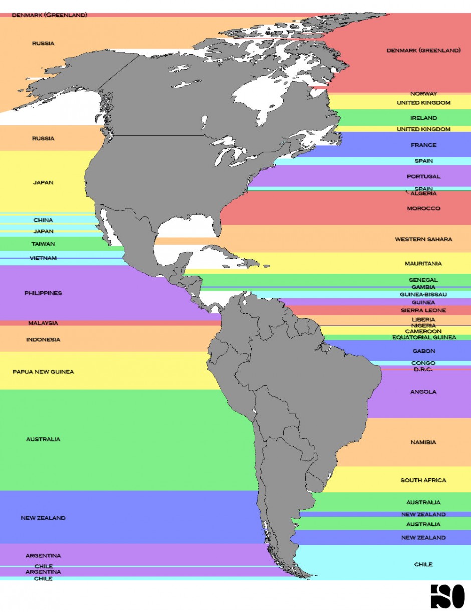
4. What’s across the ocean from you
When we were kids, we’d sit on the beach in Florida and ask our parents what was on the other side. “You’re looking at England!” they’d say. Well, no. We were looking at the Western Sahara, or maybe Morocco. We’d have to be in Nova Scotia or Quebec to be looking at England. Here’s a map to help keep you from making the same mistakes. Note that parts of Chile and Greenland are looking across the oceans at themselves. Image via
5. The movements of important people over a lifetime
You can tell a lot about where cultural shifts are happening by showing where famous or important people were born, and where they died. This video shows hundreds of years of culture using that simple measurement. Give it a watch.
National Geographichas an awesome interactive version of this map on their site, but it’s interesting to see the areas that would be the most affected by a massive rise in sea level caused by climate change. The continent that appears to be the least affected is Africa. Image via
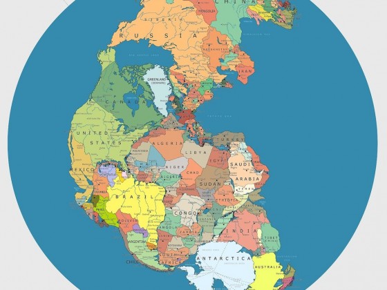
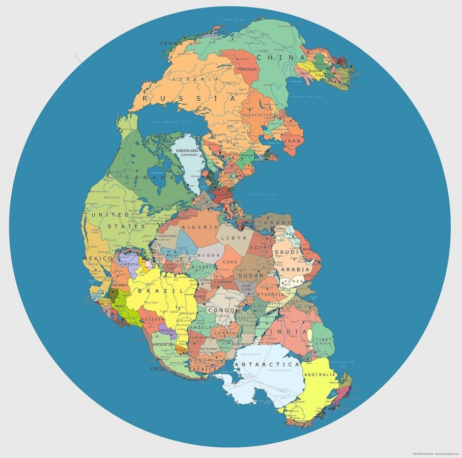
7. Your country (during Pangea)
You’ve probably seen maps of Pangea — the super-continent where most of the world’s land mass was bunched together hundreds of millions of years ago. But who would your neighbors have been? The East Coast of the United States would have been next door to Mauritania and the Western Sahara, while India would have been scrunched up with Antarctica. Image via
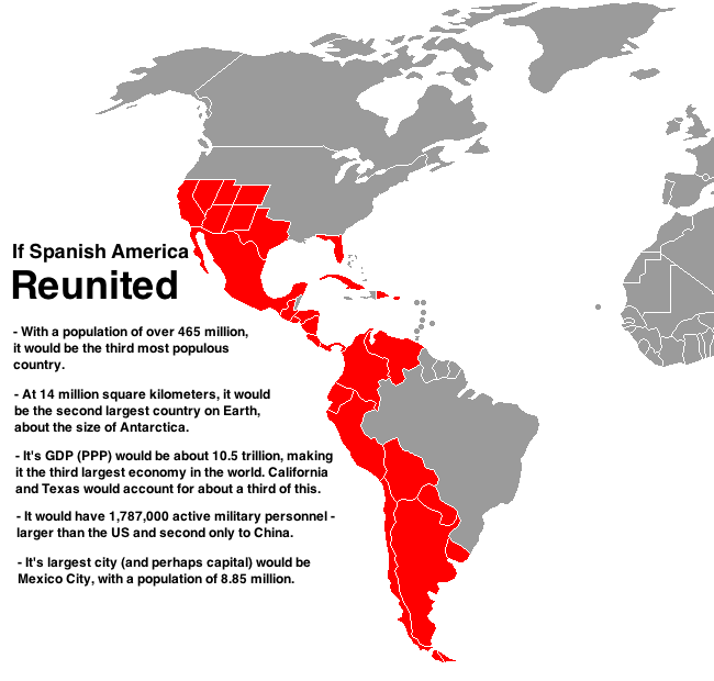
8. A reunited Pan-Latin America
The history of how a large chunk of the United States was once part of the much larger Spanish Empire is, unfortunately, not that well known. Image via
9. Composite map of 30 people’s attempts to draw the world
Because we like to feel smarter than other people, and because Jay Leno is done with his Jaywalking sketch, we now have the internet phenomenon of asking people to try and draw or label maps of the world. This Reddit user actually made it slightly clever by creating a composite of the maps he received, and making it look like a real map of the world. Image via
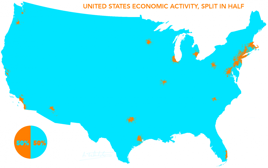
10. US GDP split in half
Despite being a pretty huge country, the vast majority of economic activity in the United States occurs in its major cities. It should be noted that Denver, Cleveland, and Atlanta are all in the blue area. Image via
11. Countries ending in -land (in the English language)
Not all maps need to contain useful information, but I think this map is interesting because it illustrates how many of these places (and places without “land” in their name) are named not after the land itself, but after the people in the country. Image via
12. Countries ending in the letter A (in the English language)
English speakers love ending countries in “A.” What else is there to be said? Image via
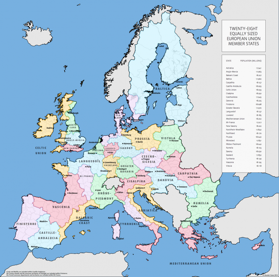
A popular map experiment is to redivide existing areas to be “equipopulous.” Basically, what would the countries in a certain region look like if they all had the same population? It’s already been done for the United States (check it out, it’s fascinating); here it is with the countries of the European Union. Image via
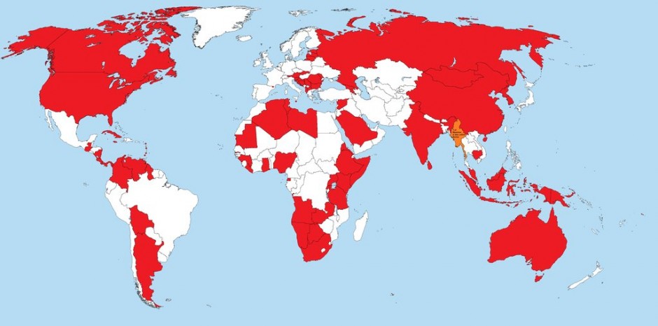
14. Countries that recognize the state of Palestine
One of the oddities of becoming a state is that you can’t really become one until other nations agree to it. Due to its controversial relationship with Israel, Palestine is not officially recognized as a state by much of the Western world. What’s interesting, though, is how much of the rest of the world does recognize Palestine. Image via
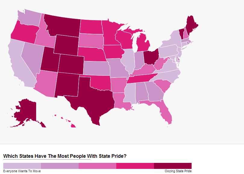
15. States with the most state pride
Okay, full disclosure: The methodology for this map’s data is sketchy at best. It’s actually a measure of the percentage of a state’s population that “Likes” the state on Facebook. Not super scientifically valid — people could have simply visited Texas and really liked it, but they may not have any real pride in the state. My home state, Ohio, is the #1 winner. More specific rankings are available on Movoto. Image via
16. The world’s empires before WWI
Seeing as 2014 is the centennial of the start of World War I, this map seems particularly timely. These are the major empires of the world just prior to the war. After 1914, everything changed. Image via
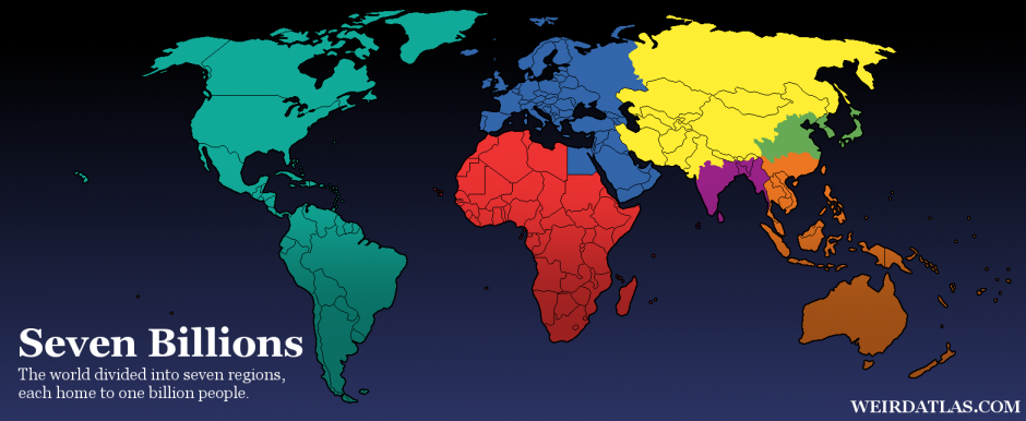
17. The world split up into billions
Our global population is now estimated to be closer to 7.2 billion people, but the most fascinating aspect of this map is the insane concentrations of populations in places like South and East Asia, and the relatively low population densities of the Americas. Image via
18. World civilizations since 3000 BC
A really great depiction of how empires formed, grew, and collapsed over time has been waiting for the YouTube era. With a slightly better music choice, this video could’ve been perfect.
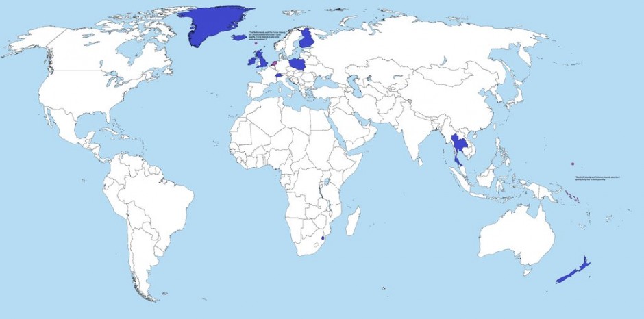
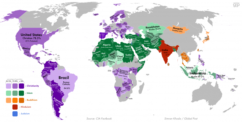
19. Countries where over 50% of the population is religious
Even though we constantly hear stories about how atheism and agnosticism are on the rise, most countries are still pretty religious. The only major, glaring exceptions are communist countries or formerly communist countries (though Cuba is actually still very religious), and countries where we just don’t have enough information to be able to tell. Image via
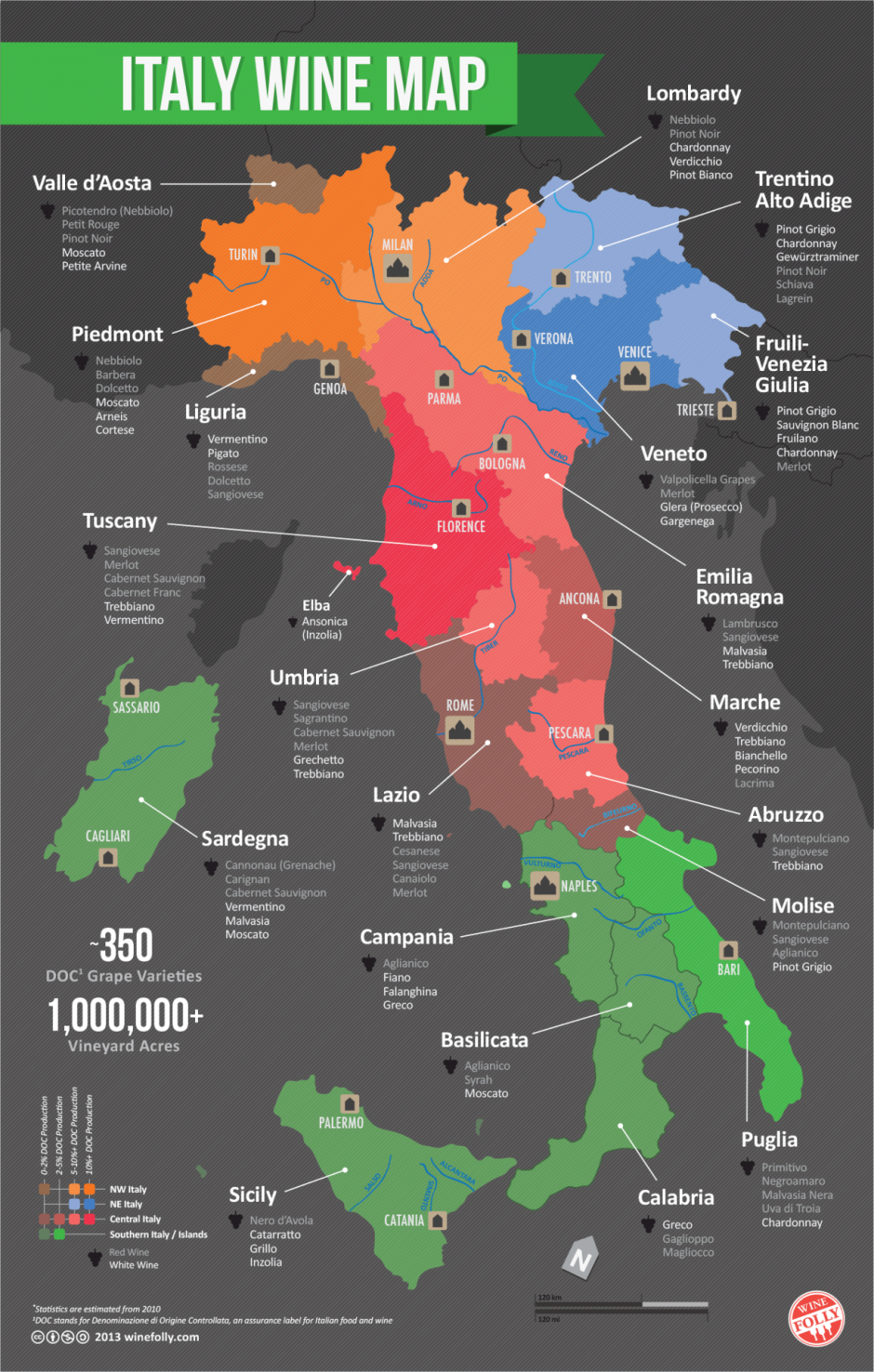
20. Italian wine regions
You probably know the names of some famous French wines like Bordeaux or Champagne. French wines clearly have good publicists. But Italian wines, despite being of a similar level of quality, aren’t as well known outside the wine world. Here’s a primer for the regions of Italian wines and the varietals they produce. Image via
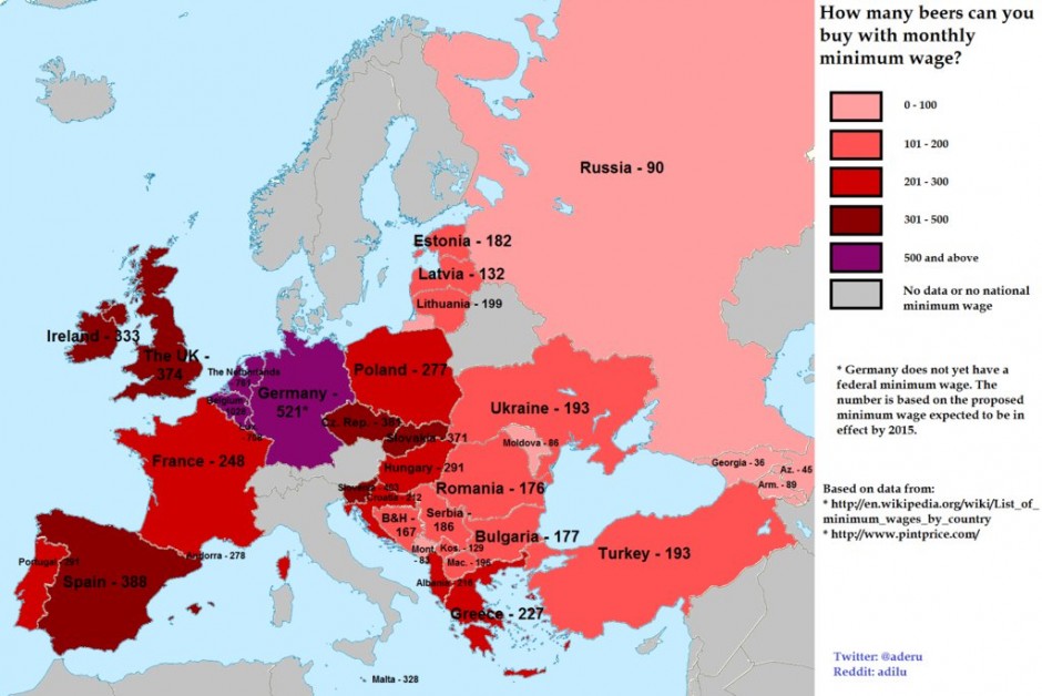
21. How many beers can you buy (in Europe) with your minimum wage?
Living on minimum wage is the worst, so naturally, you just want to drink all the time. But in some countries, you really can’t buy all that much beer each month. I think the British Isles and Germany are safe, but Georgians can only afford 36 beers per month — just a little over one per day. Ouch. Image via
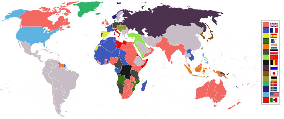
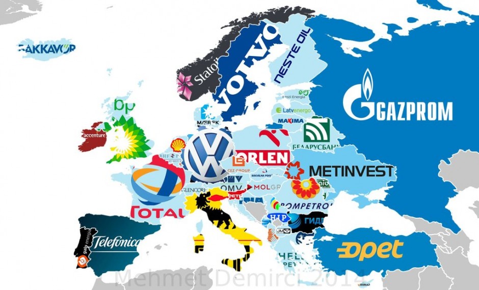
Knowing which company is a country’s biggest can tell you a lot about that country and its economy. See how many of these you can recognize. Image via
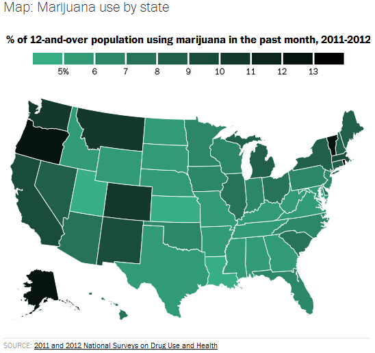
23. Pot usage by US state
One important thing to note about this map is that Colorado and Washington hadn’t implemented (or even passed) their pot legalization laws at the time this data was taken. Image via
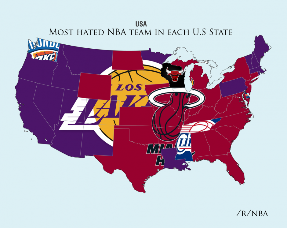
24. The most hated NBA teams by state
Look, everyone hates the Lakers and the Heat, but it’s the few exceptions on this map that are really interesting. Image via
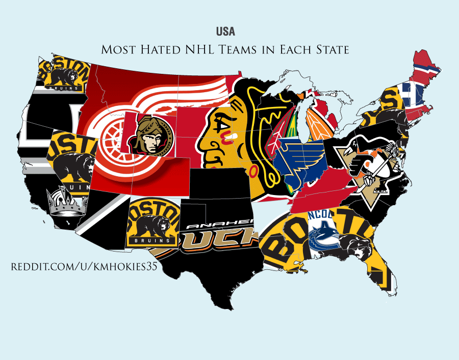
25. The most hated NHL teams by state
The most hated NHL teams is a little more diverse than the most hated NBA teams, but it’s still pretty clear who people hate the most. Image via
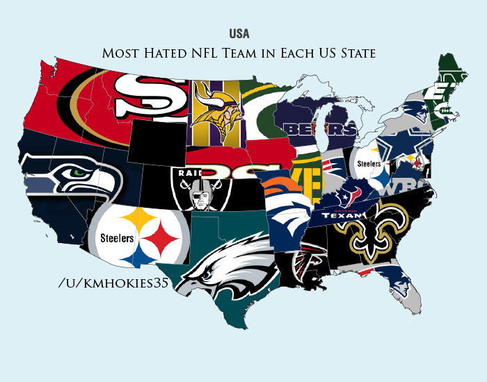
26. The most hated NFL teams by state
It’s a sad day when you realize your team — say, the Cincinnati Bengals — has never been good enough for any state to develop a really strong hatred of them. Image via
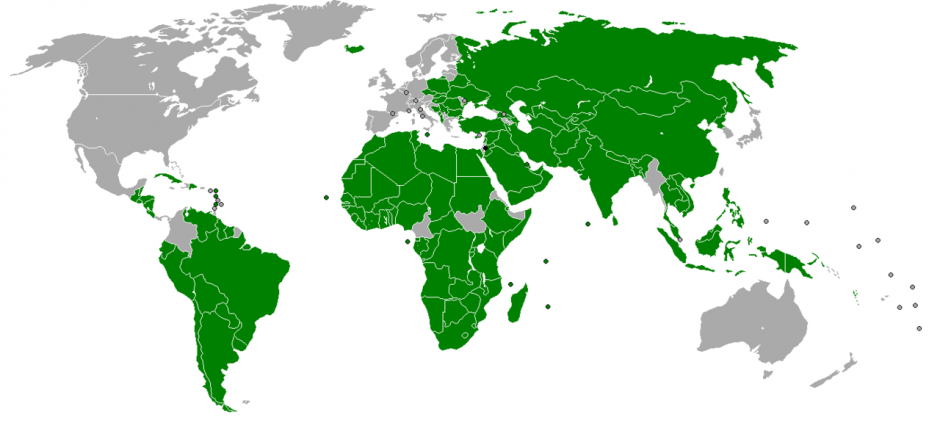
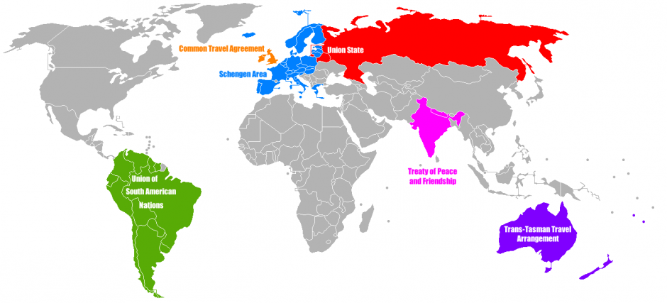
27. The world’s open borders
The world is pretty far off from having open borders ever being a thing — but some residents of some countries can freely travel across their frontiers into other countries. Here are the places where that holds true. Image via
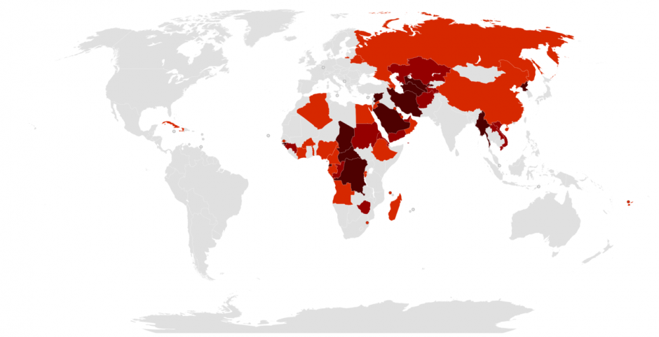
28. Countries governed by authoritarian regimes
In 2012, The Economist listed the world’s authoritarian regimes. There are more left than you’d think. The darker the shade, the more dictatorial. Image via
29. Countries with ongoing conflicts
Wikimedia does a great job of keeping this map updated — this version is for August 2014. The orange-yellow color means there are fewer than 1,000 deaths a year in that conflict; the red means more than 1,000. Image via
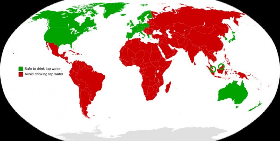
30. The CDC on which countries have safe drinking water
Probably the most clichéd travel advice is “don’t drink the water.” Here’s where it’s true, according to the Centers for Disease Control. Image via
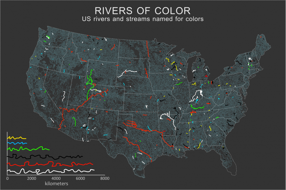
31. US rivers named after colors
You’d think the famous “Green River” from Creedence Clearwater Revival would be on this list, but it turns out the song actually refers to Putah Creek near Winters, California. Image via
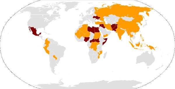
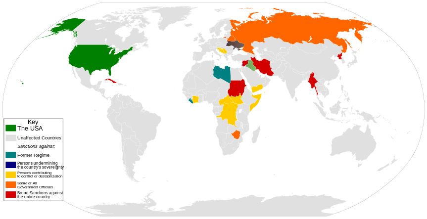
32. Countries the US is sanctioning
There have been plenty of news stories lately about the US and Europe sanctioning Russia, but that’s not even close to the only country we’re currently wagging our finger at. Image via
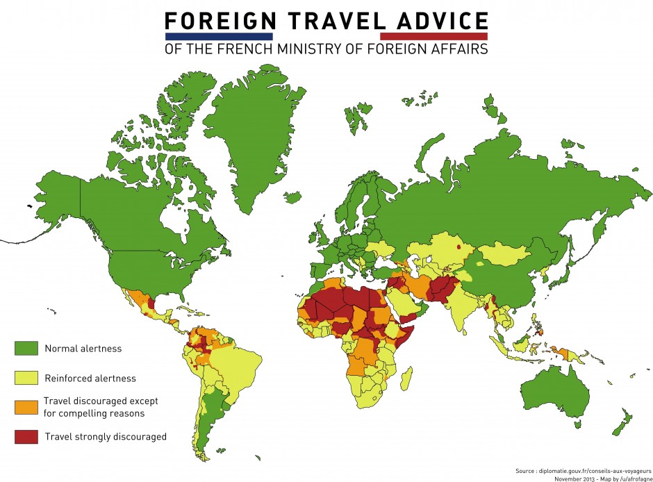
33. Where it’s okay to travel (according to France)
A lot of countries give their citizens foreign travel advice. Here’s where France thinks you should and shouldn’t go. This information is as of November 2013, and so Ukraine is yellow and just at the beginning of its protest movement. Image via