BLOOMBERG collected information about 163 countries in the world to create the Bloomberg Global Health Index and rank and map these countries from the healthiest to the least healthy. The index was based on data such as “life expectancy, causes of death and health risks ranging from high blood pressure and tobacco use to malnutrition and the availability of clean water”, explain Wei Lu and Vincent DelGuidice for Bloomberg Markets.
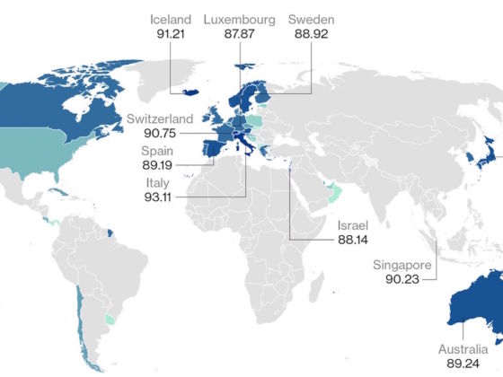
Photo: Bloomberg markets
Mapped: The Healthiest Countries in the World
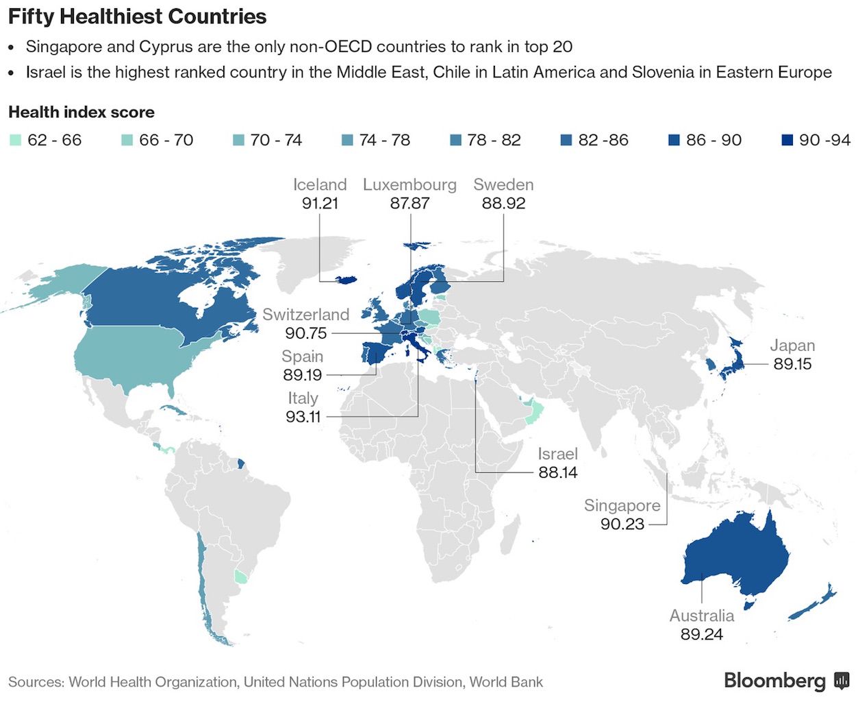
Photo: Bloomberg markets
The results: Italians are in incredible shape and score a health index of 93.11 while the US rank 34 out of 50 (behind Costa Rica, Lebanon, and Cuba) with an index of 73.05.
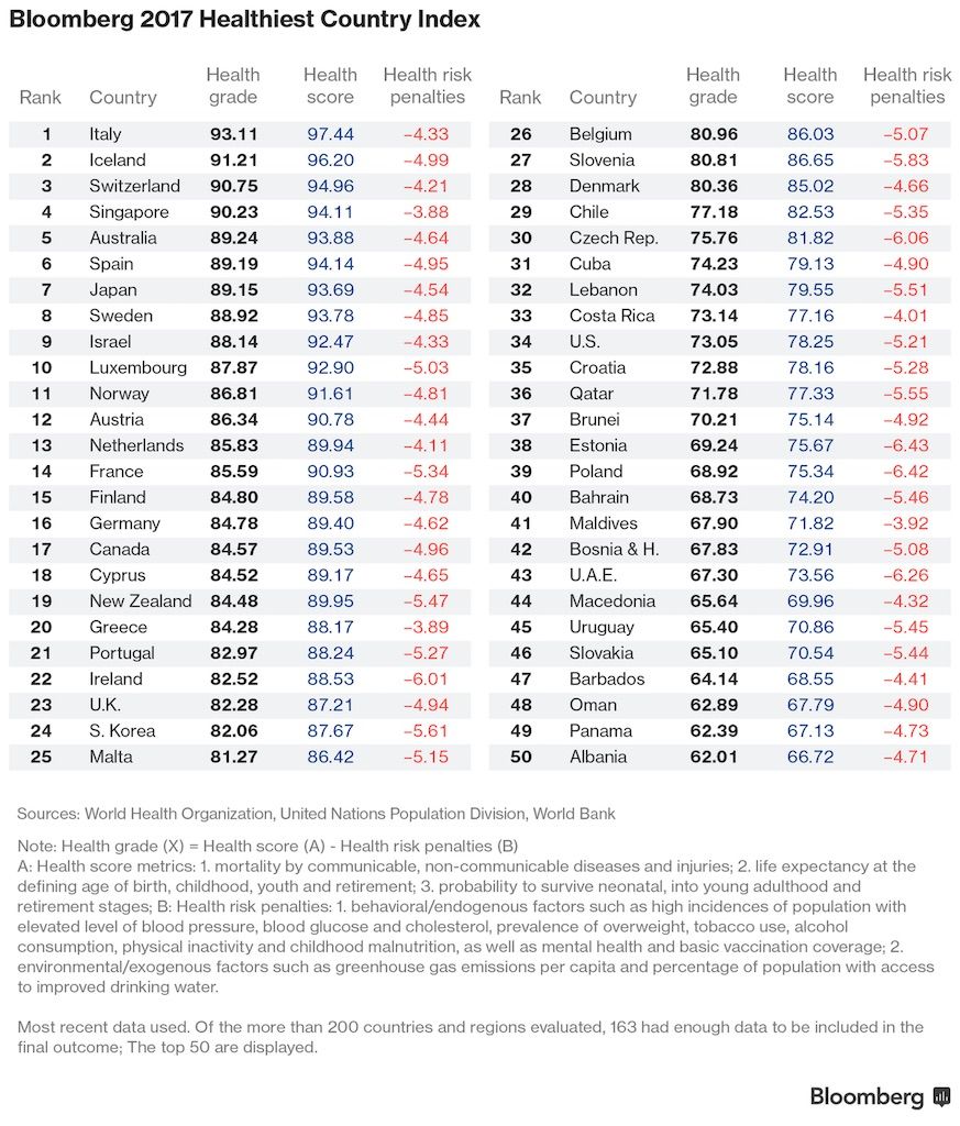
Photo: Bloomberg markets
Although the Mediterranean diet may have something to do with the good health index of Italy, Greece, Malta, and Cyprus (they are all featured in the top 50), eating habits don’t explain why Iceland, Switzerland, Singapore and Australia are in the top 5 — but access to high-quality healthcare just might.
How does your country rank in this chart? Let us know by leaving a comment. ![]()