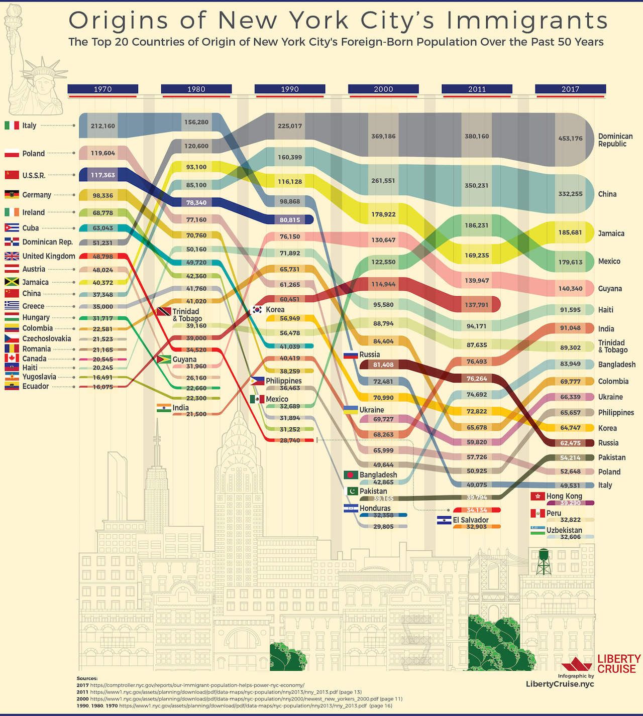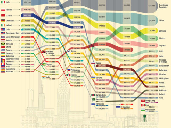
The impact immigrants have had on New York City is immeasurable. This infographic, created by LibertyCruise and posted on Reddit by user FoxyFoxMulder, shows how the city’s immigrant population has changed over the past 50 years, and which countries currently claim the largest piece of the Big Apple.
If you thought that Italians had the highest numbers in New York, you’re about 40 years behind the times. While Italians made up the highest percentage of immigrants up until the 1980s, their numbers have been in sharp decline ever since, with just under 50,000 remaining. There are currently over 450,000 immigrants from the Dominican Republic in New York City, far more than from any other country. Quite a few New Yorkers come from a Chinese heritage — about 330,000, according to the chart. Also on the rise are Guyanese, Indians, and Bangladeshis, each accounting for a rising percentage of the city’s population. There are also about 185,000 Jamaicans in New York.