Climate change has become one of those controversies that shouldn’t be controversial at all. If you don’t believe the countless scientific studies confirming the dramatic increase in global temperature, just look at the polar ice caps melting at unprecedented rates. Even if you’re a staunch believer in climate change, however, the phenomenon can be difficult to actually visualize since the process has taken place rather subtly over thousands of years.
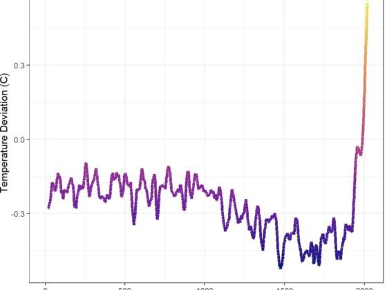
Photo: bgregory98/Reddit
This Visualization of the Global Temperature Over the Past 2,000 Years Is a Shocking Wake-Up Call
This chart posted on Reddit by user bgregory98 is a startling visualization of how the global temperature has changed from year 0 to 2019. The chart uses data from a 2019 Nature Geoscience study to present the fluctuations of global temperature over the past 2,000 years.
[OC] Two thousand years of global temperatures in twenty seconds from r/dataisbeautiful
As you can see, the global temperature has periods of rising and falling. Between 1300 and 1850 we entered a period known as the Little Ice Age, during which global temperatures dropped. Starting in the 19th century, however, temperatures began a steady climb and then rose in a dramatic way throughout the 20th and 21st centuries.
Visualizing global warming — seeing the global temperatures rise before your eyes — is a shocking revelation. If nothing else, it drives home the urgency of the issue and serves as a helpful wake-up call for all of us. ![]()