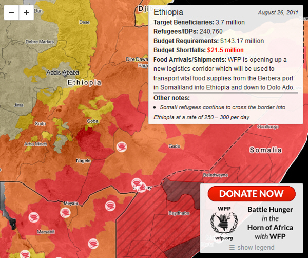
For map nerds like myself, we tend to take in spatial information better than straight up numbers and statistics, and the World Food Programme, along with Development Seed, are mapping the wide-reaching effects of the famine all across East Africa. The map below shows all the WFP’s distribution centers in the region, the hardest hit areas in red, as well as some statistics and funding numbers.
Mapping the Food Crisis and Famine in East Africa
by
Lola (Akinmade) Åkerström
Aug 26, 2011
What can mapping tell us about famine? The devil is in the detail. Or in this case, the distribution.
According to Matador’s Richard Stupart:
Note how the famine follows national and provincial borders? Natural disasters don’t do that. Disasters of politics, markets, and economic policy do.
Definitely a lot of food for thought, especially since many media outlets are reporting the famine as most likely man-made. If you’re looking for ways to help and reach famine victims, we’ve compiled a quick list of five international organizations worth contributing to.
Trending Now
7 Adventure Travel Ideas for Your Escape to Belize
Jan 31, 2025
Sponsored
The Story Behind One Epic Photo of the Stars in Saskatchewan, Canada
Feb 10, 2025
Sponsored
8 Ways to Spend Your Vacation Outside in Sunny Southwest Florida
Feb 3, 2025
Sponsored
The 25 Dreamiest Island Airbnbs in the US
Jan 17, 2025