What’s the first thing you notice when you’re sitting in the airport, staring out the window at the plane you’re about to board? Maybe you’re watching the baggage guys handling your luggage with all the delicacy of a bowling ball, or wondering how more birds don’t get stuck in the whirring propellers. Chances are, your eye is drawn first and foremost to the airplane livery. The livery is essentially the airplane’s paint job, comprising the airline’s name, logo, and signature colors.
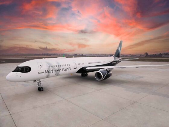
Photo: Northern Pacific Airways
How Airplanes Get Their Paint Jobs, According to a Livery Designer
Sometimes they’re particularly colorful and creative, decked out for a special airline campaign, like Southwest’s “Colorado One” livery — painted in the style of state flag — or Alaska Airlines’ “Spirit of Disneyland” livery featuring Disney characters. Not all liveries are cool or colorful, but each has a dedicated artistic strategy behind it.
As you stare out the window, you might find yourself idly wondering, “what does that logo even mean?”, “Who came up with that color scheme?”, and “Is designing an airplane livery an actual job?”
Yes, it’s a full-time job, and a pretty cool one too. Edmond Huot designs commercial airplane liveries for a living. Founder of the design agency Forward Studio, Huot’s latest project was for the new long-haul US airline, Northern Pacific Airways. We talked to Huot to learn more about airline paint jobs, the rules governing livery design, and the designs he’s proudest of.
This interview has been edited for clarity and length
Matador: How do you manage to remain creative and put your own touch in a design that is so limited?
Edmond Huot: I follow a brand design and identity. In the case of Northern Pacific Airways, I conceived of the entire brand — from initial concept through to execution. The colors, typography, graphic motifs, and subsequent identity and marketing touchpoints were all born out of an overarching thematic narrative and mood board. Incidentally, the mood board is an important design tool that acts as a sort of filter, helping to mitigate a wide range of subjective design decisions. The brand’s tone and character must always align with any and all graphic selections.
Do you sometimes have to defend your design to the airlines?
There have been occasions where I’ve had to quite literally stand up in defense of an idea or design direction. I’m not sure whether it’s my Taurean nature, but I’m quite passionate about what I do. I believe my clients are looking for that level of ownership and conviction. Obviously, it requires a fair amount of tact and diplomacy as well.
It also helps to invest a good amount of time and energy into mock-ups, which really bring the designs to life. My clients need to see themselves in the design. I spend a lot of time curating an expert team of designers, writers, animators, and renderers. If I don’t get the design right early on, I run the risk of losing momentum, which can ultimately frustrate and confuse the client.
What statement do you think an airplane livery should make?
A strong livery program must serve a wide range of interests and criteria. From a branding perspective, the design needs to accurately represent the airline’s values and characteristics. The design must work with and complement the physical shape and form of the aircraft itself.
From the travelers’ perspective, an effective livery should stand out both high in the sky and on a crowded, cluttered tarmac—from artfully designed color schemes to highly refined graphic icons that simply but effectively transcend geography, culture, and language to communicate universal themes. It’s been my experience that airline marketing is somewhat akin to a tourism campaign, as airlines are in many ways synonymous with the same themes and values of the countries and geographic regions they represent.
What are the most famous airplane liveries that you’ve designed?
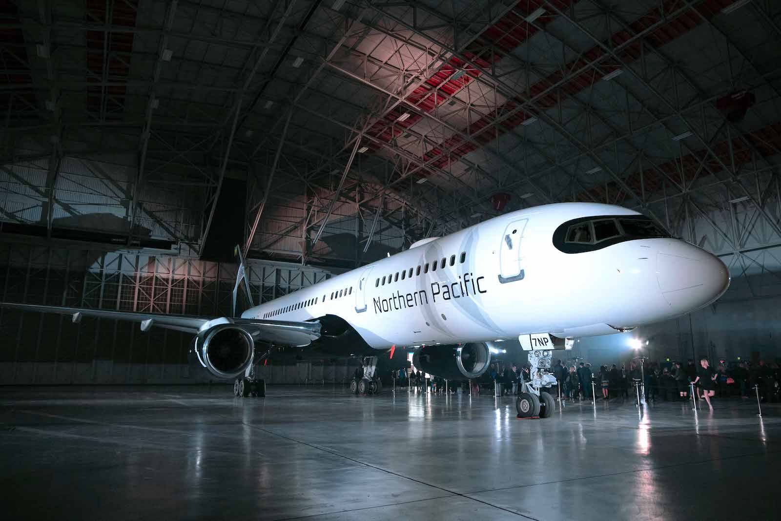
Photo: Northern Pacific Airways
Northern Pacific Airways is the most comprehensive and ambitious branding project I’ve been involved with. I also worked on a design project for the Honolulu-based airline, Island Air. The airline was being groomed for purchase by the billionaire, Larry Ellison of Oracle Corporation. I found myself working directly with Ellison, helping to communicate and translate a range of design ideas and requests in the best way possible.
Have you ever flown in an airplane that featured your livery — and did you brag about it?
I think my family and friends have done more bragging on my behalf! Northern Pacific will be the first airline that I fly on featuring my work. And for the record, when I say “my work,” I really mean my team’s work. I could never do this without the help and dedication of some truly talented and inspired individuals. That is what’s really worth bragging about!
Which livery are you the proudest of, and why?
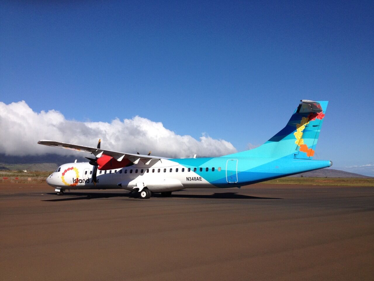
Photo: ClarkHuot via All Forward
Each livery project comes with its own highlights and badges of honor. Island Air, for example, featured a rather daring and exhilarating air-to-air video shoot where I, along with my videographer, were tightly crammed into a small Beechcraft turboprop that did these extreme passes above and below the airline’s newly painted ATR 50.
Northern Pacific Airway brings me joy because I was given a great deal of autonomy, which in turn helps empower the highest level of ideation, design, and production. I’m both proud and grateful for that.
Is there an airplane livery that you have not designed that you wish you had?
Absolutely! I’ve always been a fan of Northwest Orient’s livery design. Butler & Zimmerman’s design program featured a bold, yet simple red tail design along with a striking and sharp decal treatment featuring a monochromatic palette of white, soft grays, and black. CP-Air’s famous ‘orange bird’ design by Lippincott & Margulies is another favorite of mine. The livery showcased Canadian Pacific’s multi-use arrow-in-circle icon with a rather unconventional color palette of red, orange, and steel gray accented by an iconic swooping line motif. These designs were then, and are today, imaginative, brave, elegant, and enduring. I wish I could have been a part of their conception!
What do you like best about designing airplane livery?
Beyond the initial conceptual phase, where my team and I get to stretch our imaginations and aspirations, there’s nothing — and I mean NOTHING — that compares to walking into an aircraft hangar to see (for the first time) my design applied to a 137,000-pound, 155-foot-long Boeing 757-200 series. The sheer scale of this aircraft in all of its aerodynamic and technological beauty is beyond extraordinary. It’s truly life-affirming! ![]()