Everyone I know wants to live in New York City. As a NYC native however, I’m sick of hearing people complain about why their lives suck as a result of their move. Maybe if they saw this map of American migration patterns in 2013, they’d realize that New York had the highest amount of residents who left the state in search of presumably greener pastures (and a much lower cost of living).
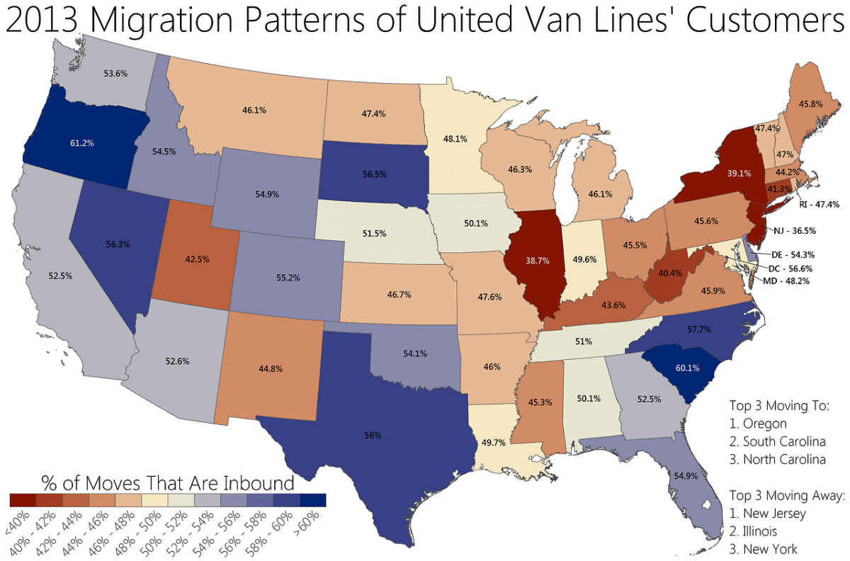
Photo: Business Insider
Plan Your Next 'Move' With This Map of US Migration Patterns
by
Katka Lapelosová
Jan 20, 2014
The United Van Lines map is particularly telling, but what’s even cooler is this interactive map produced by Forbes in 2012. Type in any US city, and see where people from that community moved elsewhere to in the country, as well which counties had people crazy enough to move to your hometown.
It will be interesting to see how these patterns develop within the next ten years, as Millennials begin to influence the homeownership market – is this generation more apt to rent apartments in large cities, or will they desire to eventually have a home of their own in a more cost-effective area of the country?
(H/T Business Insider)
Trending Now
Sponsored
Relax, Explore, or Go All In: 3 Ways to Choose Your Chill in Southwest Florida
May 7, 2026
The Most Surreal Car-Free Islands in the US
Apr 22, 2026