Photo: GlobalPollution.org

Mapped: Environmental Pollution Around the World

Maps + Infographics
by Henry Miller Nov 9, 2017

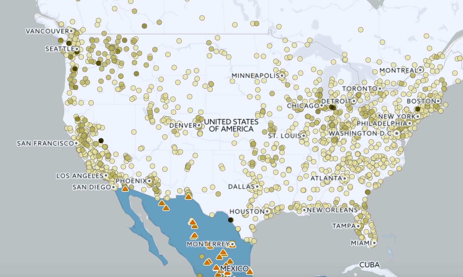
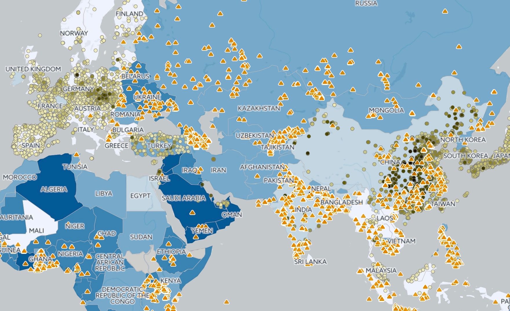
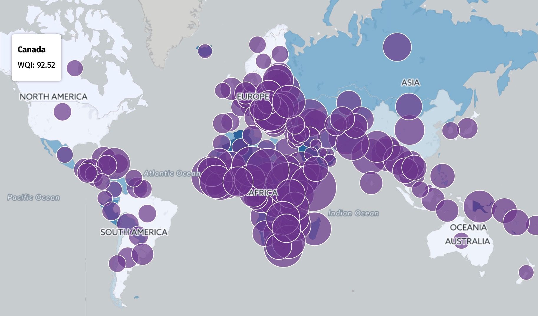
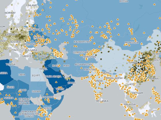
While the media has covered stories about chemical spills, smog and water contamination, it is hard to get an idea of how bad pollution is as people experience it every day. Pollution.org has published this “Global Pollution” interactive map and what it reveals is fascinating for those trying to understand how different policies set by different governments affect pollution levels.

While a lack of information makes it hard to compare anti-pollution policies nation to nation, the number deaths caused by pollution in each country makes it clear that this is a serious problem everywhere. The stills below were taken on 11/8/17.

1. A map of air pollution in the US:

Each dot represents a regularly updating data monitor. The dots get darker as air quality decreases.

2. A map of all pollution across Eurasia:

The orange triangles represent site contamination (e.g. chemical spills). The blue shade over countries represent water pollution (the darker the blue, the worse the quality of water).

3. A visualization of the number of deaths caused by pollution worldwide:

Each purple circle represents a certain country and grows with the number of deaths attributed to pollution. The US loses 483 per million lives every year, while Nigeria loses 1,411 per million and China loses 1,341 per million.

Discover Matador