Photo: TomTom/Reddit

These Charts Show the Dramatic Decline of Traffic in Cities Around the World

News Maps + Infographics
by Eben Diskin Apr 7, 2020

One side effect of the coronavirus crisis and the consequent stay-at-home orders, is the dramatic reduction in traffic in cities all around the world. This would be good news if we actually had someplace to go, but as it is, the few times we do leave the house are for quick runs to the grocery store, the post office, or to pick up food.

traffic

Photo: TomTom/Reddit

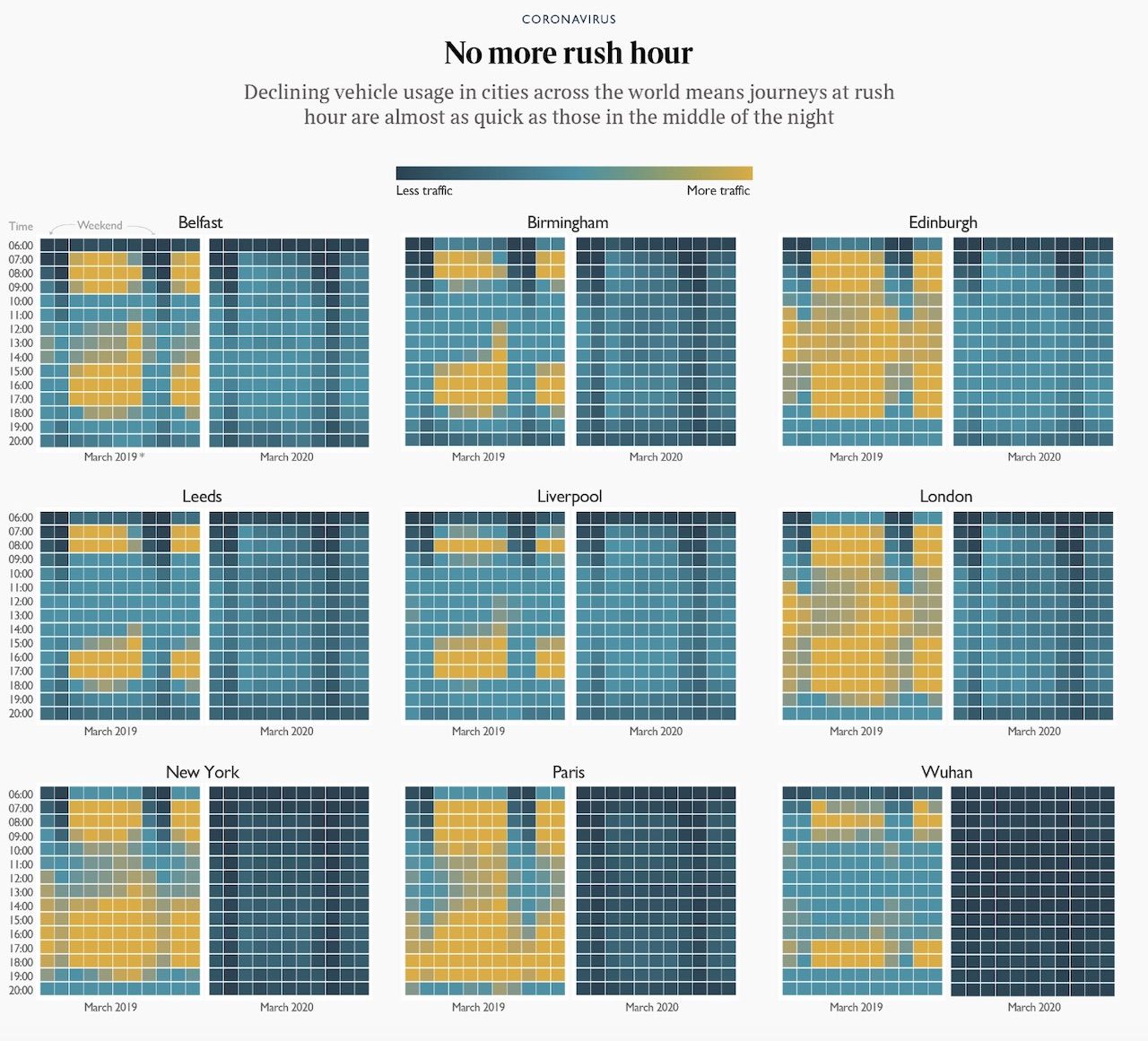
This map, with data compiled by TomTom for its Traffic Index and shared on Reddit by user DanClark93, shows just how drastically traffic has declined in major cities across the world. It compares traffic from March 2019 to traffic in the same month of 2020, charting the volume at each hour of the day.

In New York, London, Edinburgh, and Paris, that decline is obvious. In March 2019, the colors indicate fairly consistent traffic throughout each hour of the day. Looking at the March 2020 square, however, traffic has effectively grinded to a halt. Wuhan is the most extreme example of this slowdown. As China instituted a complete lockdown of Wuhan — the city where the virus originated — hardly even letting citizens out of their homes, it makes sense that there would be almost no cars on the street.

NYC traffic

Congestion in New York City in the past 7 days (Photo: TomTom/Reddit)

Wuhan traffic

Congestion in Wuhan in the past 7 days (Photo: TomTom/Reddit)

London Traffic

Congestion in London in the past 7 days (Photo: TomTom/Reddit)

Paris Traffic

Congestion in Paris in the past 7 days (Photo: TomTom/Reddit)

Discover Matador