As important as it is to stay informed during a global epidemic like the new coronavirus, it’s equally important to prevent the spread of misinformation, which can cause unnecessary panic. All it takes is the publication of one inaccurate statistic or map to drive people into a frenzy, which could end up exacerbating the problem instead of simply promoting caution. For example, one map depicting global air travel (unrelated to the coronavirus) was mistakenly shared as an illustration of the virus’ spread.
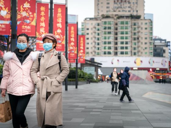
Photo: IHOR SULYATYTSKYY/Shutterstock
This Misleading Map of the Coronavirus Sparked Unfounded Panic
The BBC reported that in early February, the World Population Project at the University of Southampton published research that predicted where people from Wuhan had traveled in the weeks prior to the quarantine. Researchers tweeted out several messages and maps about their work, including one map that showed the entire network of global air travel, with red lines criss-crossing all around the world. The problem was, this map was not linked to the study in any way.
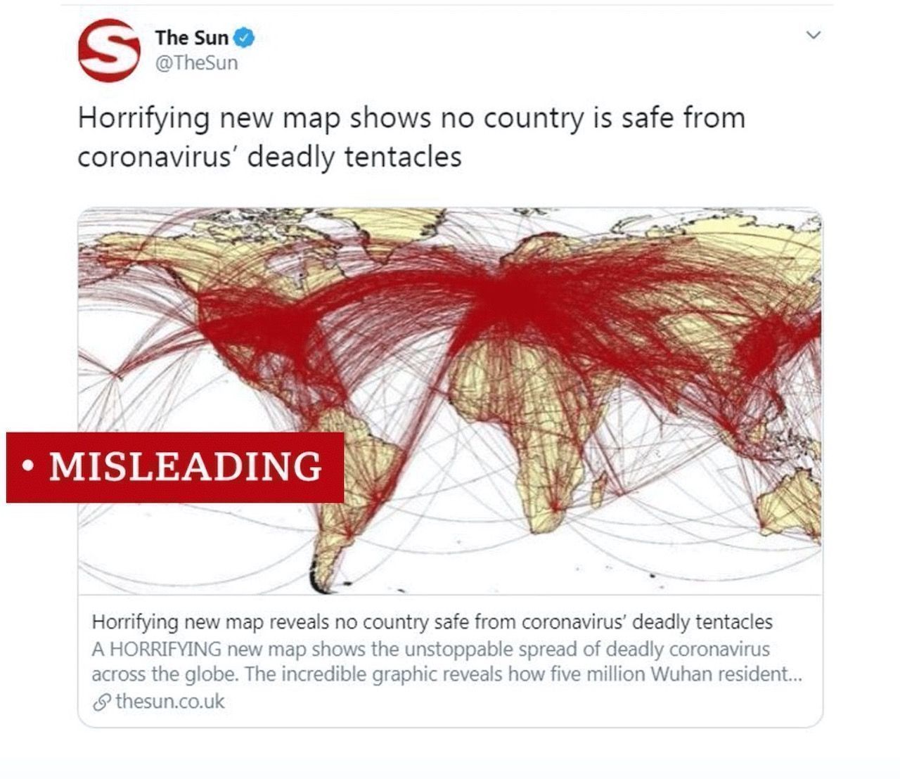
Photo: BBC
When asked, the team clarified that the map, covered in red lines, was not part of the study. It was merely shared with the intention of illustrating the vast extent of the global air network. However, the damage had already been done. The map was picked up by several Australian news outlets, used in TV discussion between pundits, and viewed several million times — all under the false assumption that it depicted the spread of the virus globally.
Despite the fact that the map is now known to be false, it remains in many news outlets’ coverage of the story. The incident highlights how important it is to not only seek information, but to make sure that information is accurate, comes from a reputable source, and is being analyzed in the appropriate context. ![]()
H/T: BBC