It can be difficult to conceptualize just how populated the United States really is. Many US states are more populous than some countries, and that doesn’t just apply to the high-population states we might commonly think of, like California, Texas, and Florida. Even the sparsely-populated states in the nation are home to as many people as some entire countries.
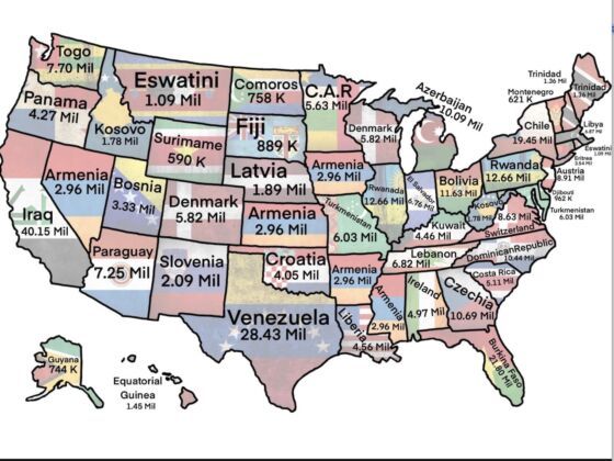
Photo: Landmarker1YT/Reddit
This Map of the US Compares State Populations to That of World Countries
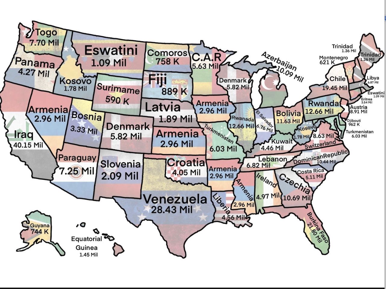
Photo: Landmarker1YT/Reddit
Reddit user Landmarker1YT created a map that makes it easy to visualize which states are comparable, population-wise, to some countries. California is similar in population to Iraq, Texas is comparable to Venezuela, and all of Chile could be contained within New York. What might be more surprising, however, is that Nebraska has roughly the same population as Latvia, and Pennsylvania alone is the same size as Rwanda.
Coming to terms with the sheer size of our population can help us understand one of the reasons why it is so hard for us all to remain undivided. Maps like these make it obvious that we’re more like 50 countries all sharing a continent, rather than 50 states all unified under one culture, background, and set of values. ![]()