In the 1960s, commercial flight was taking off. More airlines were offering more destinations on ever larger jets. Personal and business travel quickly became more feasible for more people. The decade was a part of what would come to be known as the golden age of plane travel. It was also the golden age of airline advertising, which sold the idea of an open world in part through high-quality posters.
Courtesy of Airline Visual Identity 1945-1975
Relive the Golden Age of Plane Travel Through the Era’s Gorgeous Airline Art
A new limited-edition collector’s edition of the book Airline Visual Identity 1945-1975 from Callisto Publishers collects some of the most eye catching commercial art from United, Air France, Pan Am, American Airlines, TWA, and others. The book has hundreds of high-quality poster reprints and is hefty in terms of size (12.2 by 16.1 inches), weight (14 pounds), and price ($400-plus). In all, the tome is insight into a time when an airline’s branding materials were closer to what you’d find in the modern art wing of a museum rather than an online pop-up ad.
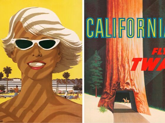
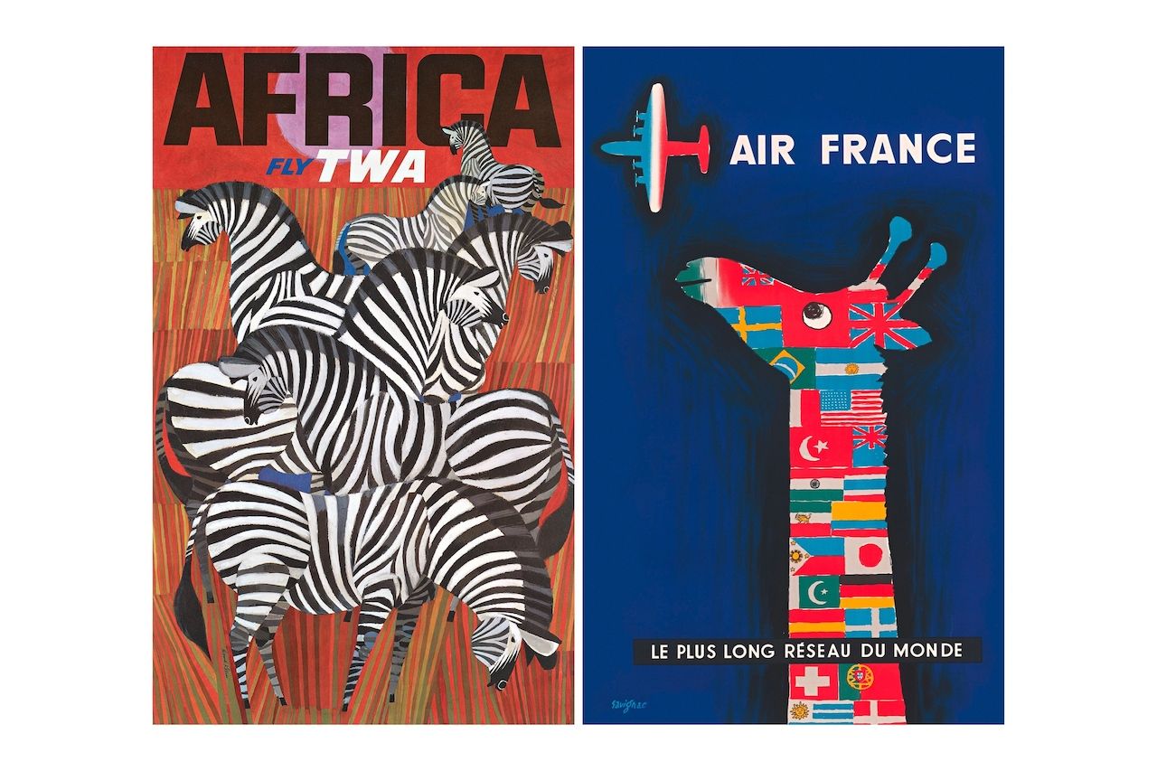
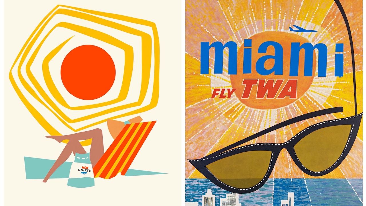
Left and right: David Klein. Courtesy of Airline Visual Identity 1945-1975.
At the time covered in the book, the industry was highly regulated and there wasn’t much difference in price between the airlines. Instead, each airline stood out by emphasizing the vibe of the destination through posters hung on the walls of travel agent offices and airports. Eye-catching colors, foil printing, and embossed design lured potential fliers in.
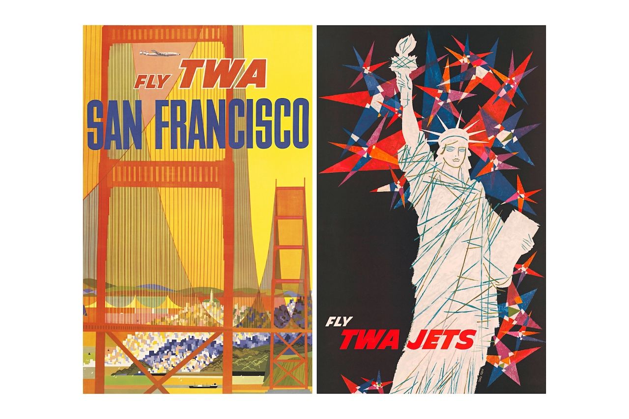
Left and right: David Klein. Courtesy of Airline Visual Identity 1945-1975.
The book’s author, Matthias C. Hühne, who is also the owner of Callisto Publishers, chose the period between the post World War II years to 1975 for the strong emphasis that the major airlines put on design at the time. Consumerism was rapidly changing with the rise of modern business branding in the 1950s. In a 2015 New York Times interview, Hühne noted that airlines during this period started to pay attention to how advertising by destination could impact the perception of the brand.
Left: Peter Ewart. Right: Anonymous. Courtesy of Airline Visual Identity 1945-1975.
Prior to the war, commercial flight was limited. The major airlines like Pan Am didn’t face much in terms of competition, and therefore had no pressing need for flashy advertising. Hühne ended the books collection in 1975 because from the latter half of the 1970s onward, television advertisements and technological advancements in flight changed airline print advertising. Additionally, the airline industry in the United States was deregulated, which meant that airlines were competing over price, not appearances and other intangibles.
During the period covered in the book, however, airlines presented themselves as the pathway to an open world largely through posters. Commercial art was going through a shift at the same time. Pop art, minimalism, and conceptual art flourished. Many artists needed to supplement their income, and advertising, led by creative agencies along New York City’s Madison Avenue, provided money and an outlet. Still, the purpose was advertising, not art, and the artist couldn’t be tracked down for some pieces even through Hühne’s extensive research.
Left: David Klein. Right: Raymond Savignac (art direction, Jean Carlu). Courtesy of Airline Visual Identity 1945-1975.
The idea to gather this artwork into one book came to Hühne when he saw a 1950s Air France poster in the late 2000s, he told The New York Times. His interest in airline advertising, and the artists who made the work, only grew from there.
Left: Victor Vasarely. Right: Manfred Bingler. Courtesy of Airline Visual Identity 1945-1975.
Hühne’s collection of works adds context to the era and each major company throughout the book. He cites the dates and artist when available, though sometimes that information is lost to history due to either an artist who requested anonymity, poor corporate record keeping, or other various reasons. The work was also at the time considered very much in the world of commerce, not art, Hühne writes.
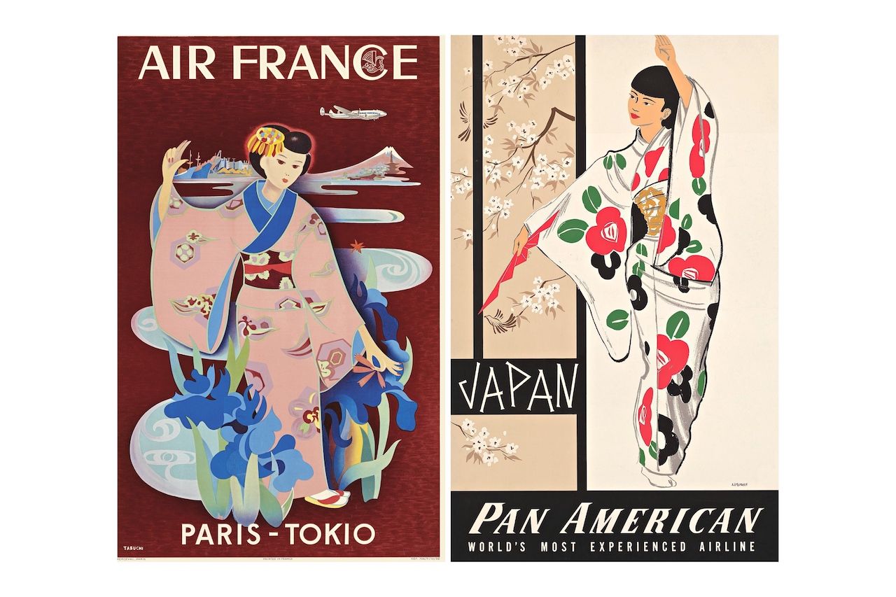
Left: Yasse Tabuchi. Right: A. Amspoker. Courtesy of Airline Visual Identity 1945-1975.
“The quality of a poster’s design is sometimes judged by criteria similar to those applied to fine art,” the book reads. “And indeed, many posters are of outstanding artistic merit. However, a poster must be first and foremost an effective advertisement, and therefore its design must serve to attract attention and to strengthen the intended marketing message.”
Left: Anonymous. Right: Joseph Charles Parker and Martin D. Glanzman. Courtesy of Airline Visual Identity 1945-1975.
The book also includes other aspects that defined an airline’s branding, like liveries and brochures. Posters, however, are the striking centerpiece of attention of what Hühne describes in the book as “each airline’s visual language.”
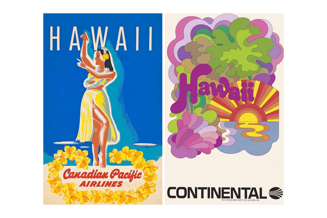
Left: Anonymous. Right: David Klein. Courtesy of Airline Visual Identity 1945-1975.
The resulting work defined some of the most forward facing promotions of each major airline. Light hearted posters with contrasting colors advertised fun in the sun and ideal escapes, while photography gave other posters a sense of realism.
A Pan Am series of posters in the late 1950s by artist Aaron Fine is an early example of what was to come. Fine’s series covered 20 destinations, including Paris, London, Japan, Hawaii, and the rest of Europe. Bright colors and clean lines were the norm throughout the 1960s. An exception was United Airlines, which used “a palate of conservative color schemes and symbols” to create “a reassuring environment for passengers,” Hühne writes.
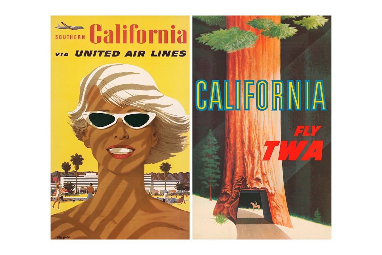
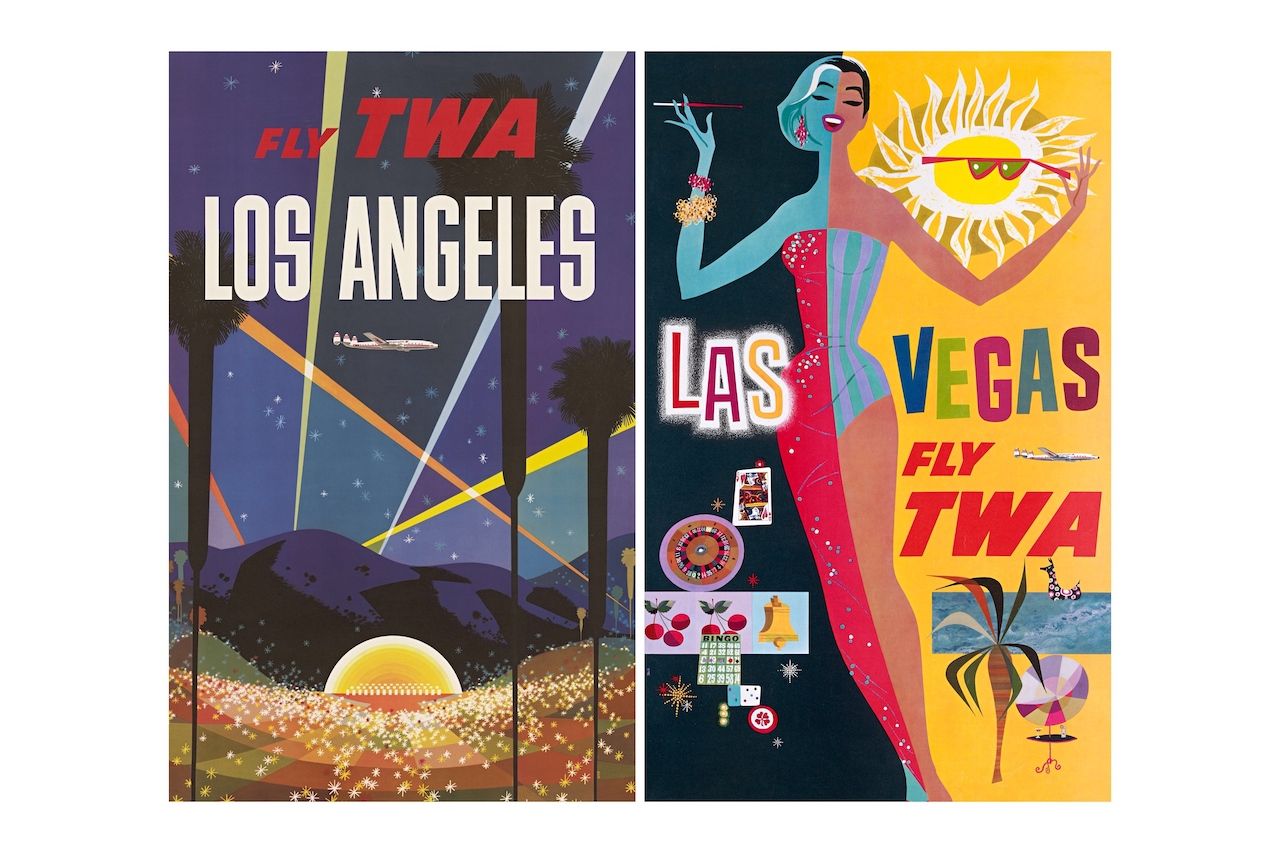
Left: Stan Galli. Right: David Klein. Courtesy of Airline Visual Identity 1945-1975.
International airlines like Air France, Swissair, Lufthansa, Japan Airlines, and Russia’s Aeroflot are included in the book along with the domestic airlines. Posters intended for the Western audience had similar pop-art touches regardless of where they were produced.
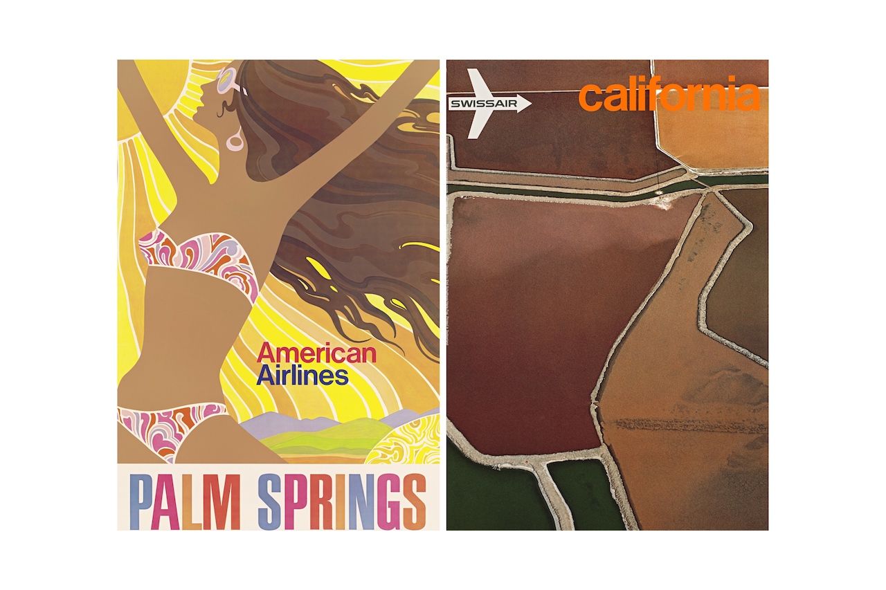
Left: Anonymous. Right: Emil Schulthess, Hans Frei, and Georg Gerster. Courtesy of Airline Visual Identity 1945-1975.
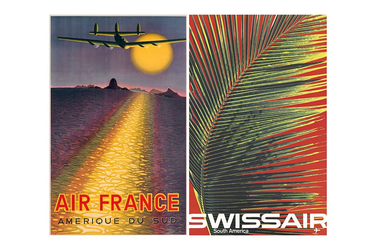
Photography was the other side of the poster design coin. While graphic design often depicted an idealized image of a location for the airlines, photos provided a real inside look. Swissair utilized minimalist photographs like a sun for Japan, an empty beach for the Mediterranean, a palm frond for South America, and an overhead shot of the Amazon rainforest for Brazil. Some of the starkest differences between the photographic approach and the graphic design approach to posters can be seen when you look at the many pop-art images for California travel compared to Swissair’s 1971 photo poster of California fields from above by Emil Schulthess, Hans Frei, and Georg Gerster.
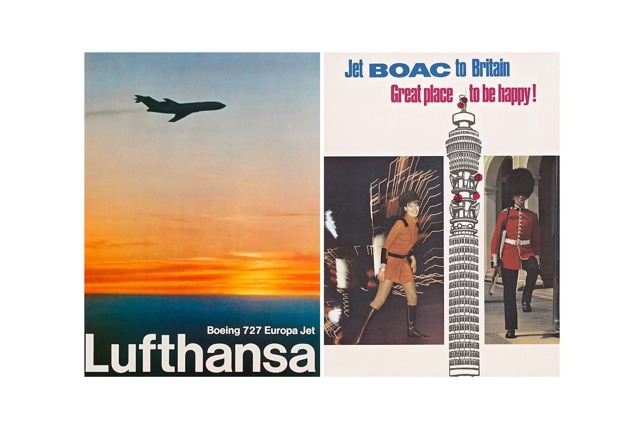
Left: Lufthansa. Right: British Travel. Courtesy of Airline Visual Identity 1945-1975.
It can be hard to imagine an airline putting the same amount of focus on high-brow commercial art today. It’s all about the small details and showing up first (and with the lowest price) in an online search. The coronavirus pandemic has devastated the airline industry as a whole, and it wouldn’t be surprising to see airline identities change for years to come in order to center on cleanliness and safety initiatives.
For the most dedicated travel lover, Airline Visual Identity 1945-1975 offers an escape to a more luxurious time long before people had to pay for their meal or a window seat. And, most importantly, it was a time when airline advertising was as functional as it was aesthetic. ![]()